This specialisation project was dedicated to the gathering and application of knowledge around one or more research topics, then applied to several experiments, and concluding with a series of final deliverables, upon which a reflection is undertaken in the form of a post mortem. This particular project was dedicated to two main areas I wished to iterate and improve upon: composition, environment and perspective in 2D art, and After Effects compositing and animation workflows. With the intention to prioritise visual appeal and composition fundamentals, the final deliverable serves to illustrate my accumulated knowledge over the past trimester.
The primary goal of this project was to emphasize the missing or neglected areas of 2D art that I had failed to approach throughout my course as an animation student, and the years prior as a general character artist. Although I already have a developed skillset in this area, I had rarely, if at all, attempted to navigate through the following topics. Despite my original intention to submit a series of five environment animated featurettes, due to personal / external concerns and an underestimation of the sheer time needed to devote to each sequence, it suffered a reduction to two final submissions.
During the primary stages of this project, I felt I had a good grip on both the balance between other project’s workloads and the initiation of both the report and the commencement of my experiments. I found that, even with no experience regarding environment painting, I was able to muster a good end result with the cards used in the Rapid Production Project, and went from a poorly rendered environment to a well-rounded and solid attempt by the end of a week.
Although my progress was not as dramatic in the coming weeks, I still retained a sense of pride seeing my final deliverable, having never attempted backgrounds prior. Characters, which previously felt disengaged from their placement within the scene, felt unified and belonged. I established a workflow for my final deliverables quite early on, with regards to my approach to rendering. Starting with a base sketch, filling in underneath with colour, and then rendering in a layered approach, major portions were separated between the backgrounds, as demonstrated by the following gif:
In addition to the high improvement curve, I managed to catalogue a successful amount of research (detailed in the research report & specialisation note documents). I more than fruitfully was able to grasp the reigns of After Effects as a beginner to the program, and despite some earlier technical difficulties associated with the preview pane, I was able to get very familiar with the interface and preliminary functions quite early on in the trimester. This extended into more detailed effects, presets and their execution, to the point where I was able to apply them to character edits without having to revise tutorials I had approached in the past. The unification of both my personal art style and the functions of After Effects may have opened the gateway for a new type of editing commission, or simply just that of more exhaustive and incorporated personal projects (both of which I am looking forward to).
Unfortunately, I feel this progress may have been more notable had a focused on a quantity versus quality approach to my environment experiments. As I was bogged down with detail and other unnecessary particulars, I neglected the entirety of the composition, as is evident in my earlier thumbnail attempts. Although these compositions are not necessarily poor, they could definitely be improved upon, especially with the emphasis on blocking-out and restriction of colour values from various sources as demonstrated in my research report. Despite my bulk of research, I felt a lot of it went over my head and needed revisiting throughout the duration of the project (not including After Effects elements, as I was fairly familiar with those, rather concerning the theory work surrounding composition, etc.).
Despite the imminent progress, I am conflicted about the end result of my project, particularly in regards to my work ethic towards the pointy end of the trimester. Productivity was greatly hindered in the last few weeks, most notably between weeks 10-11, which both totalled under 20 hours. With little amounted to in terms of drafting for my final deliverables, both paintings were conceptualized, rendered and animated during week 12, in stark contrast to the little I had performed prior. This was mainly the result of several culminating factors (that can be elaborated upon request) concerning both my personal and family life. This is reflected in both the lack of final deliverable work (in contrast to what I had originally promised myself) and the miniscule experiments completed over the duration of the project. This fault may be reflective of my poorer work ethic during certain weeks, or perhaps simply the project being too out-of-scope for someone of my calibre to handle fully.
An additional concern regarding this project being out-of-scope is my underestimation of the sheer time it would take to render a fully-realised piece, alongside the animation element. Rather than the “a painting per day” milestone I had intended for the final week leading up to the culmination of this project, I only managed a total of two paintings, which were extensively rendered over several days. In contrast to my previous experiments, I was not experienced in such detailing, predominantly in the “Clairvoyance” scene, which can be attributed as my major achievement of this project. Even the full-piece experiments took several hours to compose and execute. In future, it would do well to allow for some leeway regarding the concepting and execution of the final deliverables.
Regarding the bulk of research performed, I feel as though I could have executed more experiments before beginning the finalized deliverables. It became apparent that too much of my time had been divulged doing theory research and neglecting actual experimentation when it came to the mid-way point of the project, and I had gathered 5000 words of research on composition alone (not counting the summaries on After Effects tutorials I had begun to detail within my progress journals) and barely any experiments to show for it. Once again bringing up the “quality versus quality” approach, I feel as though my progress would have been more extensive if I had looked into their implementation rather than prioritising the theory work behind it. In the end, not all the research was even relevant to my final research report, and several sources had to be cut down or discarded entirely.
Another concern that arose over the duration of this project was simply the vagueness of my project task list. Although the composition and thumbnailing experiments had a set structure, when it came to the After Effects side of my specialisation, I find that I waffled when it came to deciding the nature of my experiments. Despite gathering an extensive list of resources and tutorials to complete regarding After Effects – they were extensive, and that seemed to be the root of the problem. I had no structure to what I wanted to achieve in this area, and instead I floundered a lot and picked whatever tutorials I saw first. The underlying problem was my lack of organisation in the beginning stages of this project, which can mainly be attributed to a simple lack of knowledge of the program. I had no idea the sheer scope of what After Effects could achieve, and thus it felt difficult trying to narrow down what exactly I wanted to learn. Regardless of the mishaps, I managed to localize most tutorials viewed, cater them to what I wanted to achieve in the final deliverable, albeit only towards the later mid-way point of the project’s duration.
Upon reflection, it is also tangible that I remained too much within my comfort zone regarding the subject matter of my experiments. Although I made it evident I wanted to place a focus on environmental work, as was the case with my final deliverables, my experiments seemed to cater to my own personal taste – that of my original character work. My original intention was to use their incorporation sparingly, but, as always, to make the project more enjoyable I threw them in at every available opportunity. Whilst this may not necessarily be a bad thing, it may have hindered my progress by taking up the space where environmental studies could have been achieved. Though it is a good device to be able to have your personal preferences bleed into your work, I acknowledge that I do it far more often than I should be, and will endeavour to cut back on this implementation in future project (or at least, make sure their integration is relevant).
If given the opportunity to complete this project again, I would definitely place an emphasis on pushing myself out of my comfort zone, and to be more concise regarding the After Effects side of the project. This may be achieved with more structured preliminary research, and by setting down the fundamentals of what I intend to learn from this project above all, rather than stumbling around an exhaustive list of resources that I will be unlikely to fully realise. Clearer goals in regards to what I want out of the project is a staple of what would likely be a better-realised and developed project. Once again, clearer goals, particularly concerning the due dates would be beneficial in all areas of the project. I would have additionally liked to have created more thumbnails and experiments during the earlier stages of this specialisation, with weight on rougher, messier environment concepts that I could potentially develop and execute with more precision in the near future when my skills were more honed.
Overall, this specialisation project heralded two new areas of expertise I had not otherwise explored: After Effects and 2D environments. As I had taken a backseat on previous projects that involved AE, I was heading into the project almost entirely blind (discounting the preliminary experiments I had conducted for my Rapid Production Project). Notable digital painting fundamentals include the incorporation of textures (both overlays and brushes), atmospheric haze for large-scale environments, and storytelling elements. These elements encapsulate hero or focal elements, context of the piece, and the arrangement and point of view of the scene execution. I detailed the digital painting workflow, from conceptualization to rendering and execution, in addition to the animation side I applied with my After Effects Studies. The compositional hierarchy (balance, structure and focal elements) and their unification with other subsets of composition (negative/positive space, framing, positions of ambiguity and guiding lines) became a staple of my pieces execution post-research. In additional to learning the interface and preliminary functions of After Effects, I gathered knowledge on various effects and presets, the most notable of which consist of blending modes, track mattes, scripting and adding expressions, 3D layers, curve editing, the optics compensation kit, noise generation and post-production colour grading.
Concerning future goals for skill development, I intend to undertake more ambitious personal projects that incorporate the fundamentals of environment and composition. In particular, I want to pursue full environment pieces and conceptual work that I could not otherwise undertake if this project was not a reality. As already evident by the uploads on my Youtube channel, I intend to keep pursuing character edits, and to simply improve with regular and consistent practise, and perhaps engaging in the After Effects tutorials I did not have the time for otherwise. Some particular topics of interest include After Effects plugins to real-world footage, more advanced character rigging, and further familiarising myself with the existing plugins before approaching external ones such as those provided by Video CoPilot. To continue my progression with 2D animation, I intend to participate and execute some exercises over the holidays. These animation “memes” usually feature a formula that is then repeated throughout the animation community, as an exercise and / or personalised event. I aim to pursue some personal (albeit unified) projects involving the skills applied in my specialisation project (e.g. animated scenes involving character rigs and/or puppet pinning).
This specialisation project encapsulates two major areas I wanted to explore and improve upon: composition, environment and perspective in 2D art and After Effects, animation and VFX. Whilst I already had a grip on the other areas of 2D art, such as character design and anatomy, I had neglected what are often considered to be the fundamentals of a 2D art. As I intend to specialise almost primarily in 2D art in the future, this was an area I needed to tackle before approaching extensive commercial work.
As mentioned prior, this project will be divided between two major topics, before delving into the sub-categories listed above. The fundamentals of composition bleed into other areas of design and visual work and was thus my primary focus for this research report. As I apply these central rules to my After Effects work, the result will hopefully be a series of visually-appealing 2D animated scenes with an emphasis on aesthetic and attention to detail.
Digital painting & Environments
“Limitation is what leads to mastery,” (Feghali, 2018).
The thumbnailing process, detailed by Feghali in his article Painting Environment concepts in No Time is a technique constructive in other fundamental areas of conceptual works and visual design (2018). By spending a limited amount of time on each thumbnail, prioritising placement and the unification of all compositional fundamentals versus being drowned in relatively minor elements such as colour value and detail. Limiting the use of colour and textural work directs the primary focus onto the compositional structure in its stead, “…you will have more choice and will hinder what we’re trying to achieve here: a proper exercise and workflow to get great composition,” (Feghali, 2018).
Feghali’s technique prioritises lighter values during the beginning stages, before working towards the darker tones, which are typically reserved for foreground detail, etc. Mid-ground elements are used to create depth, primitive technique and details in preparation for the final values, which is reserved for compositional detail, figures and other foreground elements, if applicable. As demonstrated in the following thumbnail tests, I attempted this technique on several compositional drafts.
Although I like the first piece, it could use some tweaks regarding colour value, especially in regards to drawing more attention to the focal point.
Feghali, W. (2016) Digital Painting Basics – Introduction to Speed Painting – Concept Art Tutorial [Video]. Retrieved on 10 February 2018 from https://www.youtube.com/watch?v=bDXQ8crU2hk
As a general rule of thumb, one should be mindful of the entirety of the painting during the beginning stages of the rendering process. By drawing attention to local colours and composition versus rushing into detailing too fast, one can avoid a poor composition in the early stages of the project. Value blockouts and furthermore, colours, should be blocked out before detailing. Feghali recommends the lasso tool for blocking out preliminary shapes, particularly in the foreground, as those elements tend to bring the whole piece out (2016). Being weighed down with smaller details often results in a loss of scope in regards to the entire painting, and obvious issues regarding the composition and mood of the piece will likely be missed.
Other artists, such as Greyson, recommend working in a layered approach to painting, separating each major portion of the background (2017). Clipping groups are particularly useful for layering colours, shadow and detail over specific areas without bleeding into the rest of the painting. Additionally, using a transparency lock to prevent drawing outside the silhouette of the layer tends to save time instead of repainting over areas already rendered.
Using this tutorial as a guide, I attempted several early experiments in regards to environment and rock detailing.
Composition (which leads to my next topic), particularly in environments should be broken down into shapes, such as in the following:
Uncomfortable (2015) recommends doing so to make the composition clearer, and that by drawing outlines in the shapes most evidence in your thumbnails, you remove the values and are left with a composition at its most basic stage.
Removing elements such as specific context, detail and information, the composition should theoretically remain “good” (if it was in the first place). This bare minimum composition illustrates that it is improbably to fix up a bad composition simply with the addition of detail without alteration with guiding lines, blocked out shapes and so forth. There is a stark importance on the placement of motifs and shapes within the composition – even the general position of geometry alludes to the negative space it might create, which is, in essence, just as important as the positive space.
Uncomfortable (2015) Thumbnail Painting Process[Video]. Retrieved on 27 Feb. 18 from https://youtu.be/RrRJLPt4xv4
As noted above, atmospheric haze, also commonly referred to as “aerial perspective,” – the atmospheric phenomenon that dictates that the further the object away is, the ‘lighter’ it is. Directly tied to perception of depth.
Jumping in with a lot of subtle gradation earlier on can often mess with the perception of depth in the scene, and it is recommended to block out atmospheric haze values before continuing with specific details.
*Other artist techniques include starting off with lighter values before even touching the foreground, as demonstrated in this tutorial:
Ward defines composition as “…arranging all the visual elements in the frame in a way that makes the image a satisfactory and a complete whole” (2002, pg. 10). The unification of composition fundamentals such as mass, colour and light in an arrangement that prioritises visual appeal creates the cohesion that defines what a good composition is (Ward, 2002, pg. 10). When executed in the correct manner, the composition itself will have a number of elements that guide the audience’s eye to often multiple focal points, with accompanying elements that allow for a high level of visual appeal (Blender Guru, 2014). Author Glebas writes that composition is defined by the following design principles: balance, position, dominance, unity, alternation and repetition, contrast and similarity, symmetry and rhythm (2013, pg. 121). As asserted by Glebas, contrast is described as the most important design principle within compositions, as it “affects every other value,” and can be observed in other design elements: colour, speed, direction, value and shape (2013, pg. 122).
Fundamentally, composition is broken down into a hierarchy of needs: focal element, structure and finally balance, as defined by Blender Guru (2014). The focal element is just what it says: the focus, the main element and key subject of the entire composition, helping to both ground the viewer and generate disparity between the lesser elements in the scene. Poor compositions can be highlighted by their lack of focal interest, or by simply containing too much. Elements such as subliminal guiding lines, high-contrast and framing can influence the interest generated by a focal point (and will be elaborated on below). The structure of a composition refers to “the organisation of elements in a scene based on a rule,” and can refer to any rule of composition commonly discussed within artistic circles (Blender Guru, 2014). Even limited structure has a preference over a completely naked composition. Common structural examples include the rule of thirds, the golden ratio and pyramidal composition. Lastly, the balance fundamental prioritises the displacement of visual ‘weight’ amongst a composition. According to Blender Guru, this visual weight can entail elements such as size, high-contrasting elements, saturation, faces and figures (2014).
Whilst balance does not necessarily require symmetry, these two elements are “…the two wings of a composition are equal is a most elementary manner of creating equilibrium…often the artist works with some kind of inequality,” (Arnheim, 1974, pg. 21-22). A dominant influence from one direction ultimately pulls in that direction and creates instability within the piece, which is an essential element of compositions. In general, an “unpleasant” effect is generated when a composition’s pulls are so ambiguous that the eye cannot determine which direction it is pointing; which ultimately leads to an unclear visual statement, although this may be intentional depending on the artist (Arnheim, 1974, pg. 14). It is important to note that symmetry is not a requirement for a balanced piece, and that a flat composition doesn’t automatically allude to a bad piece. The intentional choices of a composition are often derived from a scenes portrayal (e.g. that of two characters), and as long as the composition remains in-scope and in focus, with conscious design decisions, the composition is usually well-made.
I attempted a symmetrical composition example earlier on in the trimester, in combination with the “full frame” compositional rule (which basically depicts a single subject, zoomed right in; neglecting other compositional elements, and often not recommended to be used in conjunction with other structural rules (Blender Guru, 2014)). Reflecting on this piece post-research, I realise that the motif elements I had originally intended to draw in the eyes to the focal point loses the focal completely.
Rather than serving as an enhancement, they serve as a distraction. Although repetition is a favourable aspect of focal points, the “arrows” at the bottom subtly guide the eye off the page, rather than keeping it localized to the frame. The figure itself already garners enough visual weight without needing the aid of the other motifs. Looking back, I would have liked to remove the excess patterns and perhaps centre it with two of the arrows crossing over each other.
Guiding Lines
In the following example, I attempted to succinctly demonstrate the use of guiding lines within a composition. In example A, the lines are visible in the clouds, which “wrap” around the focal point, or the structure, in the distance. Although I attempted another guiding element (the light source), it was not conveyed as well as I was working with a limited, dulled palette. This may be revised by blocking out values with darker colours rather than using a sketch as a guide (such as in the technique detailed by Feghali, whose previous tutorial recommended the use of four values only, using a hard brush at full opacity). This technique helps to bolster the contrast values during the early stages of the composition. Santos writes that “muddy” values are a telltale sign that the audience may not be able to discern shapes within a composition, and it is recommended to use high contrasting values when applicable (2018).
Example A
Example B
Example B: guiding lines
In example B, the intention was to draw the viewer’s eye to the focal point in as much of a “natural” path as I could muster, with no visible disparity leading the eye off the frame. The main goal is to have these framing elements (e.g. the trees, curving rocks, dock pathway) hold attention inside the frame, and have no elements leading outside (whether it be guiding lines, light sources, etc.).’
For the following test, I attempted to using “guiding” lines (namely the curve of the landscape) to draw the viewer’s eye to the structure obscured in the distance. The colour was added as an afterthought, and I need to make better use of colour / contrasting values. May potentially look at this scene again in the future, but instead use a grayscale palette to cement the contrast before I apply a colour overlay.
Another concern was that the tree to the far left may obfuscate the directional lines on the way to the focal point. May work better if I had added an additional focal point – perhaps a figure – to the tree area, to explain the abrupt “cutting” of the guiding lines. For now it looks a bit “muddied” and serves as a way to draw the viewer’s eye off the page.
By implying lines within a composition, it can give the illusion of contour, which will be followed by the audience’s eye until another line is met. Good compositional works make use of this innate attraction, and use it to create a path wherein attention is held through every key element in a painting (Santos, 2018). It is recommended that guiding lines should remain as simplistic as possible, as large “jumps” in the smooth path guiding the viewer can lead to distraction, or worse, loss of interest (Feghali, 2017). Guiding lines, fundamentally, can either frame or direct the eye around a focal point or an area of disparity.
Disparity can be generated by numerous elements, and Santos (2018) tends to recommend an imbalance of values, such as highlights of colour. Discrepancy between saturation levels creates greater tension within the piece, and greater tension ultimately leads to greater attention. Feghali (2017) recommends using this to the advantage of the composition, by outlining the important objects/subjects in negative space, maintaining a focus on the positive space (the subjects).
Furthermore, Feghali dubs the juxtaposition of positive and negative spaces as what defines the “totality” of the painting (2018). Negative space is composed of any areas that do not include the focal points and vice versa. The main area (positive space) where the subjects are taken up should have the most dominance in comparison to the rest of the piece. This can be demonstrated by values, or even colour, such as in the following example:
One of the main purposes of negative space is to put the positive space into perspective, and should not be bogged down with excessive detail, lest it run the risk of blending too much into the areas of the focal points. Similarly, a good composition should not contain too many focal points as the audience’s eye may become “confused” as to where to look (Feghali, 2017). When subjects are localized to a smaller area, negative space can illuminate their placement naturally. Applying too much detail creates unnecessary contrast around the focal point, creating a “noisy” painting (Uncomfortable, 2015). This hectic disparity loses the clear directives otherwise achieved by a background defined by its negative space towards the focal element of the piece.
Framing
As written by Ward (2002), when composing a shot one must consider both the competition of visual elements within the composition and the nature of the framing; consider if the audience’s attention is held, or drawn away from the frame? Authors like Santos assert that this competition between forms, this disparity, gives viewers a means to compare objects within the frame, and is often regarded the root of compositions (2018).
Composition test with some personal work. Once again, upon revision, the composition was a little muddied. There are two focal points, but the first one (character’s face) whilst lit up by a light source, has little contrast around it and becomes lost in the activity beneath. This unfortunately means that this example was not “framed” correctly. The darkest area needs to be shifted from the leg area to behind the face; drawing more interest to this focal area, and to increase its “dominance” in relation to the rest of the image.
Rule of Thirds
Usually determined by placing a 3 x 3 grid on top of a piece, the rule of thirds is defined by the positioning of subjects along the junction lines, and the cross-points dictating where to place the most notable focal points of the composition. Because one element is more dominant than the other, the imbalance draws attention to the focal point. There is low significance in dividing the canvas into precise thirds, and more of an emphasis on the imbalance created by offsetting certain focal points.
Typically, bisecting an image directly into two separate halves with a focal element in the middle leads to a weak composition. If one were to place a horizontal line in the center of the image, it will typically dominate the canvas, which means a decreasing interest in the focal point (Santos, 2018). In other compositions, the central focal point also tends to “dominate” the canvas, whereas following the rule of thirds diverts focus away from the junction lines, and to key elements placed alongside them (Santos, 2018). The audience’s eye is moved around the canvas to compare the relationships between the disparity and focal points, which can be disillusioned when there is a singular area of dominance (most commonly, as asserted, in the centre).
Pyramid & Circular Composition
Other structural rules I researched included both pyramid and circular composition.
Pyramid composition is a simplistic composition technique known throughout history and is often applied without notice. Based on “triangular theory of vision, where lines recede to a point on the horizon to imply depth,” (Rees, 2018). The three points of a pyramid often represent a desired feeling, such as stability or instability, and by flipping the pyramid on its head to have the apex at the bottom, can create an “unstable” feeling generated by the shift in orientation (Josh, n.d.). In contrast, a typical pyramidal construction was a device employed to “draw the viewer’s attention to a figure or to give an impression of stability,” according to the Jacques-Edouard Berger Foundation (2017). “The idea is to structure the important elements of the scene into triangle, or pyramid, with its base coincident with the bottom of the frame…” (Tyler, 2007). Most accounts agree that the pyramid structure was intended to emphasize stability, evoking repose at its base in conjunction with the contrast provided at the apex.
One such historical example is the Disasters of War by Francisco Goya. Although the guiding lines of the composition may “follow” the angles by the supposed pyramid, angles are repeated throughout the image for the sake of repetition. Take note of the light and dark values silhouetting each each other – placed carefully to create as much disparity as possible whilst still highlighting the focal points without detraction.
Pyramidal compositions are often characterised by having subjects that “touch” each other, whether unified by guiding lines, light sources, etc. (Vieira, 2013). Subject matters that are not following the established pyramid is referred to as a “tangent,” – often seen as a mistake, but can be used as a device for generating tension, not “listening” to other elements of the composition. Despite their uniqueness, these elements should never point towards a corner, even accompanying composition elements (Vieira, 2013). Poore (1976) writes that “The use of concentric lines to draw the viewer from the lower corners of a picture to an apex of a pyramid is a common device of artists…” (pg. 43).
Whilst converging triangles can extend into the distance, one must take care not to detract away from the points of interest within the composition (Josh, n.d.).
Once again revisiting an earlier example of symmetry, this piece could have potentially adhered to the rules of pyramidal composition had I removed the motifs on the top. Alternatively, change the apex of the pyramid to the top may have suited the arrows, but would have imbalanced the character below.
As written by Poore, The pyramidal form “destroys” the spaces on either side of the figure… “Paralleling both the sides and the frame, it leaves long quadrilaterals in place of diminishing segments,” (1976, pg. 45). As intended, I aimed to have the background of this piece (if finished) blank or low-contrast, to maintain central disparity on the figure, as well as reinforce the fundamentals of pyramid composition.
Circular construction within composition allows for imminent attention drawn to the focal point, which in this case, is the character.
The background should accentuate this circle (unless there are elements of other composition forms, which is not the case here). I intended for the “exit” to be at the base of the character, where the disparity of the vines, etc. is a secondary point of interest. The base of the frame intended to be an area of “stability” rather than one that draws the viewer’s eye off the page. This may be enhanced with a vignette or darkening values around the corner of the composition.
After Effects
Masking, Track Mattes & Blending Modes
Most of my experiments (including the prior Rapid Production Project) were enhanced with that of overlays and volumetric lighting plugins. Most come into the most dramatic effect when changing the layer style / blending mode of the footage layer to Screen, which displays the black values of the sequence as transparent.
The masking technique detailed in the above source made use of feathering, so that the fall-off blended into the background, which was then further edited with some additional colour grading.
“A mask in After Effects is a path that is used as a parameter to modify layer attributes, effects, and properties. The most common use of a mask is the modification of an alpha channel of a layer, which determines the transparency of the layer at each pixel,” (Adobe, 2018).
As detailed in the following tutorial by Surface Studio, track mattes can control the opacity or luminosity of the layer beneath the track matte. A track matte layer can consist of text, shapes, other media or footage, pre-compositions, etc.
Whilst an alpha matte will control the alpha of a layer (and by extension, semi-transparency), the alpha inverted matte achieves the opposite. Track matte’s invisibility dictates the below layer’s visibility. A luma matte, as mentioned prior, defined the opacity or luminosity of the layer above. White areas of the matte will be visible, etc. and all varying shades of grey correspond to the total opacity (luma inverted matte: black defines the visible areas, and vice versa).
Blending modes in After Effects are fairly similar to the layer styles found in other art programs such as Photoshop or Paint Tool Sai. These modes are divided into eight sub-categories; normal, subtractive, additive, complex, difference, HSL, matte and utility, although my work has primarily made use of normal, subtractive and additive modes. As detailed by Adobe (2018), normal layers are not typically affected by other layers unless the opacity of layers beneath are under 100%, subtractive modes darken the colours, and may mix depending on the type selected, and additive modes lighten the source layers, akin to projected light.
2.5D Scenes / 3D Layers
As detailed in previously viewed tutorials (such as the following:)
This tutorial stresses the importance of layering assets on separate pieces, as well as retaining a clean layer comprised solely of the background. Before approaching any other detailing, the camera movement should be established to determine the positioning and angles of the objects within Z space. As a general rule of thumb, the 50mm camera is the default for slow-zoom images.
Other effects, such as the Corner pin effect, allows for manipulation of the anchor points of asset layers in order to adjust distortion as the camera zooms in. Post-processing effects such as optics compensation, lens distortion, channel blurring and light wrapping are applied afterwards. Furthermore, custom variables within Cameras such as focus distance and aperture are used to mimic realistic cameras.
To create the “light wrap” effect, the layer was pre-composed prior in order to preserve the channel blur (taking care to move all the attributes of the previous composition to the new one using the setting). A Set Matte is applied to the channel; taken from the composition copy, which a fast blur is then applied to. After duplicating this effect onto the foreground (and duplicating said foreground) a Bevel Alpha is applied.
This effect applies a “chiselled” appearance to the alpha boundaries of an image, and is a softer alternative to the Bevel Edges effect also available in After Effects (Adobe, 2018).
Other resources that can be applied to 2.5D layers within After Effects:
Lighting within After Effects is only applicable to 3D layers. When a composition involves said layers, you can apply the following types of lights: parallel, spotlight, point light and ambient lights. Whilst spotlights are the most common type of light used in lighting compositions, parallel lights are generally considered to be the more “advanced” version, as the scene is better illuminated with its use (Noel, 2016). Ambient lights, in contrast, will illuminate every 3D object evenly in the scene, akin to a “fill” light, and can act as a method of subtley changing the colour of the entire scene without the need of an adjustment layer. According to Adobe (2018), other settings of note include cone feathering, cast shadows, and shadow diffusion. One must take care to note that cone feathering is only applicable when a spotlight is in use, and that cast shadows can only be used when accept shadows is allowed (although this is a default option, cast shadows is a material option which must be on for a layer to cast shadows (this is not a default option)).
In stark contrast to fractal noise generation, turbulent noise makes use of less rendering resources, and at times can produce a higher quality image than the outdated fractal plugin. Although turbulent noise can produce better results and is less render-intensive, fractal noise can be cycled into a near-perfect loop, and may be most-suited to looping animations.
The complexity settings within the fractal noise effects panel refers to how many layers of noise are combined together for the final noise output. By altering the contrast setting, one increases the range between black and white values. This overflow determines “what happens when a pixel has a value outside black or white…” (Zwar, 2006).
Accumulating some of the resources listed below (including the Video CoPilot action essentials 2) I did a quick experiment using a piece of art provided by a friend (Source).
I used a similar method to animate the fractal noise and bound it with a track matte to the red colour layer. In addition to the evolution animation / keyframing, I added a blend mode (shade) so that the red appeared from underneath. Alternatively, I could have used a Luma Matte so the lighter values were transferred into transparency. The volumetric fog layers were downloaded from a source listed in the resources section below, whilst the fire was taken from Action Essentials 2.
Along the same vein as the previous experiment, I took an older artwork and made another character edit in After Effects. Since I specialise in that already, and it’s what generates the most traffic with my commission work, I want to see if the combination of digital concept art can be combined with motion graphics to potentially introduce a new type of commission onto my roster.
This experiment details a mash-up of older functions, most notably overlays and blending modes in combination with existing resources (the dust particles), fractal noise generation and mask feathering / restriction, colour grading (and keyframing the curves so that it changes colour subtly over the course of the sequence) and puppet pinning my artwork.
Fractal Noise Generated within After Effects; using existing plugins
Misc. Experiments
The following Shockwave tutorial detailed fractal noise generation, its application to a solid, and the Polar Co-Ordinates function, which “warps” the image into a circular composition. The fractal noise is applied, tweaked, and duplicated to recreate the “explosion” effect. Keyframing in the sub-menus of the fractal noise effect allow the evolution of the noise to be “pushed” outwards, with the brightness values at the end acting as a way to diminish the “explosion” after its duration.
The following experiment is one I conducted in accordance with the Video CoPilot tutorial. As I was unable to find the direct source for some of the plugins used, unfortunately I was unable to replicate the result directly seen in the preview.
An extension of my work on the Rapid Production Project, I delved into After Effects and the basics of which, as I had neglected to familiarize myself with it prior.
A previous piece I had edited, this character experiment reapplied several of the fundamental techniques I had learnt early on in my work in both the Rapid Production Project and other assorted experiments. There was a focus on making sure the colour grading throughout is consistent with that of the background, etc., as well as more experiments with blending modes and multiple overlays. I also attempted to swap out fractal noise generation in favour of turbulent noise, as it has a quicker rendering time. In further experiments, I want to look into doing a “looped” version so that the sequence can be replayed easily, and whilst this might be hard with the volumetric lighting files I use, which have no loop, but I could simply key-frame them out and introduce a new sequence via blurring. They could also serve as a guide as to how long I should make the looping sequence before returning to the original keyframes.
This sequence is a chromatic aberration experiment, following tutorial discussed below. The sequences were provided from Action Essentials 2 (Source: Video CoPilot). RGB splitting was created using a set channel modifier, although this could alternatively be created by eliminating the RGB layers so that each duplicate layer represents a single channel (can be achieved by apply a solid red on top using a shade layer, than setting the layer as screen / add, a technique I have used in personal work before).
Some simplistic script writing involved to make the “wiggle” effect, which saves having to key-frame it individually.
I used built-in plugins to create the following experiment, without the addition of any external features, snippets or resources (save the font used on the text). Expanding on the example, I used the same technique to add multiple fractal overlays and light sources so that the text shadows overlapped each other, etc. This experiment was not intended to be visually appealing, but rather a means of getting a grip on the techniques discussed & utilised in the tutorial that directed this experiment.
The prominent topics I learned was the construction and implementation of a 3D scene in After Effects, using masks to bind light sources, the employment of said light sources, using fractal noise (and keyframing the evolution so it appears animated), feathering masks, adjustment layers, the radial fast blur effect and adding expressions to bind effect layers to light layers.
Although I intended for a focus on developing a series of environments, my composition experiments have led me to believe that I need to practice composition fundamentals first and foremost. I intend to continue these experiments in preparation for my final deliverable, and hope that the accumulated knowledge will allow me to develop a solid concept for the animate featurette. At the moment, I intend for my final deliverables to have an emphasis on quality over quantity, especially regarding the growing workload and nearing deadlines.
Feghali, W. (2016) Digital Painting Basics – Introduction to Speed Painting – Concept Art Tutorial [Video]. Retrieved on 10 February 2018 from https://www.youtube.com/watch?v=bDXQ8crU2hk
In order to fulfil the baseline requirements for Studio 2, I contributed to two major cross-disciplinary projects, as well as a number of side projects for international clientele involving commission and design work. The first of these projects was a student-directed short film headed by a member of the film department, dubbed “Project Grief,” the second, a Studio 3 game working under the title “Isles of Time,” and later “Fujin.”
This project is an aesthetic reflection of Shinto-era Japan inspired landscapes, drawing influence from that and multiple time periods in the different areas of the game. Although originally intending to be an interactive extension of the “Latex Basic” project developed previously, Fujin evolved into a visually-appealing walking simulator with smaller puzzle elements, mainly focused on the juxtaposition of ancient and modern aesthetics within a localized space.
Animation cross-collaborators contributing to this project were given a number of tasks related to development and implementation of assets, the most notable (and applicable, in my case) being hard-surface modelling and asset design. Based on their Studio 3 Marketing module, the creation of this game was intended to be a stepping stone into the commercial world of game, and thus we partook in the creation and signing of a contract regarding payment over the coming years. In addition, the environment was iterated upon as the formation of assets progressed, replacing placeholders with the ones created by the animation department. Whilst the creative lead directed the visual direction of the project, other members of the developmental team heralded the adaptions needed as the project progressed through the trimester.
II. Contribution
Although animation students took on the tasks of 3D asset modelling, diffuse texturing, bump map generation, rigging and animation, the main contribution I provided was simply the modelling of hard-surface assets, which populated the level in their specific stylized “zones,” and eventually made an upwards of 60 models for the entire project.
In addition to their creation, I worked alongside other animation students in collaboration with Designer Joshua Bidwell to develop and understand the visual progress of the project. Assorted tasks were mainly in-person brainstorming and discussion meetings once a week for several weeks, finding references that alluded to the aesthetic in mind, and later, once the art bible and guidelines had been solidified, finalizing asset references that were gathered in a public board for the group.
Personal Reference board, later merged into a group board.
I did some preliminary modelling tests before we got stuck into the bulk of the project. As well as intending to wrap my head around the visual-aspect of the assets, I also wanted to delve into the technical side, and restrict the amount of polys needed (as originally, this project was intended to be very low-poly).
Bridge test; restricted polygon count
After their creation, we were provided with a working 3D asset list, which was divvied between the current animation students after some light discussion around working preferences. As I had already begun modelling certain types of assets after the tests, I mainly worked with tasks that expanded on the models I had already created. These consisted of shrine-gate ornaments and other assorted shrine mementos.
Mid-way through the project, it became clear that several of my previous models needed a revision as the references I was using in their creation did not correspond as accurately to the ancient / Shinto aesthetics intended for the game. To remedy this, I simply went back and iterated upon the models with the accuracies required. As many of my models were already created with generous amounts of polys (although still under the limit we were provided with), as the game delved into mid-poly territory, I did not have to make many revisions regarding their overall detail.
The shrine gate model in particular was of note, as, although I was using a reference applicable to the time period, I had neglected some smaller intricacies in favour of a lower poly-look, whilst also needed to separate the model into sub-elements so that they could be textured separately. Rather than attempt to revamp the entire model, I started from scratch, as it would have likely taken longer to try and work around the original model. The following asset is derives from this reference.
In addition, the teahouse and pagoda rooves were not suitable to the overall aesthetic. The original roof, modelled on the teahouse, was found to be suitable for both structures, and to save the time it was reused between the two.
Before
After
III. Communication
Communication between the animators, game developers and audio students was split between online and external meetings, often weekly or multiple times a week as the need arose. Despite animators typically using Slack as the main method of communication, games students used a Discord channel as the primary method of online contact. Channels were split between the games projects, and channel roles were assigned in accordance with the roles on the project. Discord served as an effective method for communicating when not available on campus as it allowed for voice calls between multiple people, which was made use of many times throughout the duration of this project.
In addition to the weekly meetings, I was kept up-to-date on the current status of the assets, and the amount of tasks due via an asset list spreadsheet that was shared through Google Drive. In addition to making use of comments to provide updates, assets were also updated with a priority system that determined which assigned assets had a higher urgency for the project. Alongside the communication between game developers and animation students, we also conferred with ourselves on the minor details of task allocation, and reflection on the status of current models. Any essential questions or information was then passed onto the development team as needed.
VI. Reflection
During the conceptual stages of this project, there were some speedbumps regarding the visual design and gameplay intentions of the final product. Although this deliberation did set back asset creation by several weeks, it did not hinder the overall production, and I still produced a numerous amount of assets. Despite the back-and-forth discussion, animators were kept in the loop to the best of abilities and were informed both in-person and over discord calls, as mentioned previously.
Even with some confusion regarding the asset lists, I made some models based on the aesthetics, which ended up being part of the final asset kit I provided. The finalisation of the asset list marked the start of a steady crawl through the list and modelling of assets. Despite an abrupt change regarding the style due to a game designer, several assets had to be revised. Although I did not have to make many revisions, it impacted the productivity of other members of my group, needing to increase the amount of detail alongside polygon count, as the visuals evolved from low-poly puzzle-directed simulator to developed mid-poly aesthetic walking simulator, and was likely the major setback in this project. It would have been more beneficial for said designer to have brought this major change during an earlier stage, and to have been more active with their input, but in my case, it wasn’t something I could have influenced.
Much akin to the animation cohort, the developmental team presented us with a pitch of their project before delving into the pre-production, production and eventually post-production (although we have yet to enter those stages, as this project will be developed over several months). As familiar to me, they implemented pre-production staples such as an art bible, cultivated a series of working references and iterated upon the project as the circumstances evolved.
In contrast, they used an alternate method of categorising and tracking allocated tasks, using a coded asset list in google docs that could be updated as the time allowed, which served as the primary means of project management. Originally, the SourceTree repository was intended to be a feature, which would have allowed as a substitute for storing the asset files, etc. and would have saved time regarding the downloading and organisation of files. This serves as a visualizer of stored repositories, and places an emphasis on coding and games projects.
Unfortunately, this feature was never properly implemented, and we ended up using the familiar workflow of Google Drive downloading and updating. The Google Drive folder was populated with all documents essential to the project, regarding its specifics, several personalised documents regarding contracts, and group sheets that gave easy access to details such as methods of contract and availability.
The game discipline’s workflow places a large emphasis on the importance of deciding asset and visual style early on throughout the project. Taking the recommendation of design Joshua Bidwell, I watched two game development conference videos, which detailed both the importance of “style through economy” and “low complexity, high fidelity,” two elements which are essential with projects like this.
Detailing the approach to Colour the City’s rendering, post-processing, etc. using a combination of low complexity functions for a high fidelity, highly-polished output, encapsulating an art style that relies heavily on subtle details; making certain that none of these subtle details distract from the main “look” of the project. Other elements of the post-processing that may come into effect in the final areas of the game: fog and volumetric lighting, HDR blooming, colour grading (post-filtering), colour banding & assorted dithering and projected details that incorporate custom lighting and ambient occlusion settings. Other elements, such as chromatic aberration and radial colour-separation, have already been a staple since the first test example we were shown in the preliminary meeting.
The low-poly art style originally to be incorporated is focused on economy above all other elements in the game-creation process, allowing for an increase in scope output. Of course, as the project became localized to detail, the environment became smaller, and smaller details became more of a focus. This workflow places an emphasis on stylistic compatibility with existing movements (e.g. cubism), resolution consciousness and consistency with polygon count, silhouetting and supplemental rendering techniques (faking “old school” aesthetics with the addition of modern game functions such as particles, shaders and techniques, or by incorporating “lo-fi” or NPR techniques alongside them).
If allowed to repeat this project, I would likely direct my focus on attempting some other types of tasks rather than being bogged down with the creation of many hard-surface assets. Whilst I do believe I succeeded, based on both output and feedback given, it would be beneficial to experience other areas of the workflow, or to simply get a refresher on processes such as rigging and texturing. One fault that I can simply attribute to being disillusioned with the workload towards the pointy of end of the trimester was me decreasing my output dramatically, in all areas, not only the cross-disciplinary projects provided. This was the culmination of several personal events (can be elaborated upon per request) and family matters. It is highly likely that if this had not occurred, I would have been able to assume a larger workload whilst still maintaining a strong ethic in other areas of studio work (for example, my specialisation project).
One notable element that I would have liked to expand upon was the use of repositories early on during the project. Although I downloaded and worked through some example uploads / downloads with a games member, I was apprehensive about their use and did not end up successfully implementing them into the workflow. I recognise their inherent benefits and would like to pursue their use in the future with less trepidation, and stress the importance of ease of access when it comes to collaborating on large projects such as these.
It would have additionally been beneficial to this project if I had pushed for a solidified visual style prior to the dramatic change in the middle of its duration. Whilst I may not have necessarily initiated any changes, it could have possibly spurred the other designed in question to reevaluate the aesthetics of the project prior to the upheaval.
The following project is a short film dubbed “Project Grief,” and was a working short film concept directed by a member of the film department. Exploring the themes of the seven stages of grief, it followed a girl’s trial over the loss of her brother. Utilizing a combination of frame-by-frame and rigging animation methods, this film aimed for the two-minute mark. Given the sheer scale of this project, we intended to have wrapped up pre-production work by the end of the trimester, and to have produced an animatic at its conclusion.
II. Contribution
As this was considered almost solely an animation project, the animators involved were heavily involved throughout the pre-production stage, providing input, etc. During the early stages, whilst we were walking through preliminary ideas and jumping around the idea of a short story, another team member and I drafted several narrative concepts that were aimed at both pursuing new ideas and developing the current story put forward by the director.
Over a meeting with said colleague (Aidan Ranger), we drafted these ideas that we believed were more ‘in-scope’ with the overall project goals, and potentially could serve as a medium for production of a personal film down the track. Using his provided animation examples, as well as some new inspirational media scoured from popular sites such as Pinterest and Art Station, we composed a list of brainstormed ideas, listing everything from developed concepts with visual examples to throwaway concepts that could be notable only with further development. After narrowing down the list to favoured options, we presented it to the other members of the group following a weekly meeting, but were not picked up in the long run as both the director and other animators were set on expanding / iterating upon the idea already put forth by the film student originally.
Several ideas, however, were incorporated into the already-existing narrative (e.g. the “blood” forest, crystal cave).
After devising a rough treatment and separating the scenes, animators were assigned a certain sequence to explore, etc. In preparation for the conceptual work, I created a Pinterest board to accumulate ideas and gather visual reference for both the character and scenes. This was separated into section that corresponded to each sequence and characters. Unfortunately, despite implementation of these sections, pins were still hoarded in the open board, and I had to organise several sections myself to avoid cluttering.
The sequence I wanted to explore was that of “anger,” represented in an ethereal forest scene that had a substance – later confirmed to be “blood,” illustrative of her intense emotional journey. This was based heavily on a singular reference image saved to the Pinterest board. To avoid retaining too many similarities, I drafted several environment concepts that I intended to retain the base concept, but disregard other elements such as palette, etc. Regardless, the most similar of the concepts was chosen to be finalised.
Additionally, I composed several colour palettes that could be used for my sequence.
As proof of concept, and to demonstrate a potential method of creating said sequence, I drafted a video test that established After Effects functions that could be put into use, and some additional sound effects we could make use of.
Based on the feedback, this video concept was considered a little too “dark” to really have incorporated what the director wanted to achieve. Later on in the project’s duration, I hope to make a revision of this concept and explore something that, whilst still retaining the gravity needed to portray the film, is a bit lighter in colour palette, etc.
III. Reflection
Along with other numerous concerns regarding organisation and communication channels, there were numerous issues regarding the sheer scope of the project and remaining within the boundaries of what we, as Studio animators, were able to achieve in accordance with our already-growing work load. Despite its potential as a short film, the out-of-scope nature of its goals (being 2 minutes long), the production did not account for the differing, and often, clashing skillsets of the animators involved. If we wanted to retain a style throughout the entirety of the film, it might be more prudent to have employed a singular animator for a character, and another for the backgrounds, etc. (as we are all students, bringing different levels of skill to the table), but would likely be out of scope to have asked for such a long animation, as certain elements (such as character animation) require more work than simply drafting several backgrounds for shots. This may have been remedied by having a solid stylistic guide that was distributed among animators (or something akin to an art bible), but this was ignored as well, in favour of the Pinterest board, which was used to catalogue ideas.
Organisational issues permeated the project throughout its duration. Although the Drive folder was disorganised in the earlier stages, a team member (Aidan Ranger) reorganised the folders, but these were ultimately neglected. In terms of deadlines, originally the working dates were applied to a Google Calendar, but as none of the team members had any first-hand experience with its use, it was promptly dropped. Despite calls for something akin to a Gantt charge to a Trello board, it never became a reality. Even with the creation of a Google Docs table with a brief description and outline, it was once again, neglected.
Another issue that was brought to the table by another animator and I was the reluctance to pursue new ideas, or to even have considered them in the first place. As mentioned before, many elements of this project could be considered out of scope, most notably the concept the director wanted to explore. Despite a series of narrative concepts that might have better suited the film – and the workload – these were neglected in favour of expanding upon his narrative, which featured numerous different settings. Unfortunately, whilst visually-rich, this diverted a lot of attention from other areas of pre-production and instead directed it towards concepting smaller details such as environments and contrasting palettes between each environment, etc. This issue was also reflected on my own inability to bring up issues regarding the narrative topic, and concerns with “romanticising” the journey of grief.
The weekly in-person meetings meant that we received consistent updates during the beginning of the project, and created a healthy environment for discussion and back-and-forth brainstorming, as well as verbal organisation regarding some deadline concerns that were brought up during the beginning of the project. In terms of online communication, despite the urge to use a more structured communication system such as Discord (which would allow for organisation between channels, pinned messages, group notifications, etc.), a group Facebook messenger was prioritised. This presented obvious problems, neglecting a ping function, pinned messages, or even the ability to group call. As a result, we were often restricted to in-person meetings, and online correspondence was difficult amongst a growing list of messages between other members. Often urgent requests or questions were lost. Whilst I made it clear that Facebook was not a media site I regularly used, it was still the primary means of communication outside the face-to-face meetings. As with all methods of online communication, the lack of emotion conveyed led to some miscommunication regarding tone, etc. Despite a team member (Tina Wei) setting up the Discord channel, it was used only a few times before descending into disuse.
The major thing I took away from this project was the need to voice my opinions, particularly as a member of a team. I am far too familiar with taking a backseat as I have done with other cross-disciplinary projects in the past, simply content with being told what to do and then completing it. When it comes to a weighty project such as this, and when animators are so heavily involved, I cannot afford to let my own concerns be drowned out by the sensitivity of others. In a business setting, it is essential to prioritise efficiency over that of feelings, and this became more and more apparent the more involved I was in the project. I need to be frank about concerns, and push for a more in-scope version of the project rather than being distracted by the potential of a good project. Even with the additions of the Discord channel and organisational fixes, it was clear that we needed to be more unified and structured as a group, with a healthy amount of communication to clear up any discrepancies between team members.
Within the film discipline, the production element of their workflow has a tendency to only span over a couple of days, in comparison to the bulk we are used to as animators. Pre-production spans over the some of the largest areas of the project duration, and prioritises storyboards and the like versus the large amounts of conceptual work usually applicable to animation workflows. Of course, this was remedied as the film was to be 2D animated. Post-production is also one of the most notable and time-rich areas of the film pipeline.
Commission Work
I. Summary & Contribution
Catering to a series of online clients from my social media networks, I drafted, designed and produced several commissions, mainly consisting of character design and replication, depending on the reference material given by the client.
Character & Design (c) Conzu 2018
Character & design (c) K. Sharpe 2018
Character & design (c) vainwin 2018.
(c) Chelsea 2018
Thumbnailing Progress / Brainstorming for Client
Character & Design (c) M. Walker 2018
II. Reflection
Of all the cross-disciplinary projects completed, this was often the most straight-forward. The social media accounts I hold already have a dedicated messenger system, and often do not require an external messenger to make sure that items are catalogued, etc. When a search function was not an option, I recorded messages by my own means and saved references to a personal Google Drive account.
One issue that was reoccurring was that, due to time zones, often correspondence took a long time to complete. As I typically send projects back and forth at different stages of their completion for revision and feedback, it took an upwards of hours to days to get the heads up before heading to the next stage of the project. As suggested by a lecturer, I employed a new method of review, which involved a Google Docs that was consistently updated with the project progress, to be checked at the client’s discretion. Of course, I still allowed some time for checking, but this proved a more effective method than back and forth consistently (which often did not account for the fact that emails may be drowned out by others, etc.). I have since updated my terms of service to accommodate for this new method of client input.
The following is a showreel I put together of all the current body of work I have achieved thus far in the trimester.
Based on the feedback given by lecturers after my final Tuesday presentation, I applied some changes to the showreel sequence, particularly the length of certain snippets. My original reasoning for such a long title card was because of the music queue, but I remedied this by editing the audio, switching around the Rapid Production Project to serve as the introductory extract, and using the remaining time to slot in the title card (whose time was reduced considerably using this method).
I additionally added in some featurettes of works done in previous semesters to bulk up the time after I had disregarded the close-ups of my animated scenes. I found that the showreel above was more suitable for my social media audience (as they have come to only know my 2D work) and thus it was kept as my youtube channel trailer. The revised version, to be used in the exhibition and as a final deliverable, is seen here:
In preparation for the final deliverables in my specialisation project, I drafted some preliminary ideas based on the pre-conceptual ones from the previous weeks I had already planned. The skull was meant to tie in with some other project ideas I had floating around (hence the “rabbit” logo, etc.), and although I’m quite happy with the subject matter in the scene, it felt too disorganised to really be a solid piece.
I intended to make use of the rule of thirds, but accidentally merged the layers before they could fully be used. As a result I had to manually select and move the skull (as seen in the second image) which really didn’t help to improve the overall composition in the first place. In fact, I hold the opinion that the central positioning was more visually-appealing to begin with, discounting the fact that it is a weak composition. The localized nature of this draft also fails to achieve a sense of scale (which is usually achieved by making a character / figure one of the focal points of the composition) and feels more like a “banner” than a well-rounded piece. Aside from some colour tweaking and preliminary rendering, I did not pursue this concept more than these drafts.
“Curiosity” Progression 1
For my first major final deliverable, I was adamant on having the sky being one, if not the main focal point of the entire composition. I ended up tweaking many of the colours of the base sketch in order to achieve a broader spectrum of colours, create more contrast and to highlight the clouds as much as possible.
In order to animate the scene effectively in After Effects, I had to separate the layers of animated areas from the beginning, and ensure they were not merged entirely with the painting. This workflow relied heavily on the separation of layers, most notably in the character rig, which, similar to 2D rigging, required a separate layer for most limbs (e.g. separating the hands from the body, ears from the head, etc.). Additionally, the powerlines were detached from the background to allow for their own distinct animation. The animation (excluding VFX and colour grading elements) was achieved through the use of puppet pins. For more fast-paced and repetitive animation that would otherwise require too many keyframes for me to possibly map myself, I used some basic scripting and worked position placement into the keyframe expression.
The second piece, and the more ambitious of the two, I intended to have more of a focus on the detailing of the environment rather than the animation of the character. Drawing influence from settings such as BlackReach from the Elder Scrolls V: Skyrim or the caves in Spyro: A New Beginning, I wanted the token alien environment – particles, bioluminescence, and not-quite-terrestrial vegetation.
First environment draft
To highlight the focal point, I wanted to have the light sources almost highlighting the main character in the middle, by both back-lighting and having the glow from the water reach their face, and for the darker vegetation to “wrap” around the edges of the picture, akin to a vignette.
Although I had originally intended to do several more pieces in this style, I definitely underestimated the sheet amount of time it takes to render a piece of this detail / size. The following details a brief look into the progress of this piece:
Final Rendered piece (without animation)
Using the same technique employed in the previous post, I animated the character, but this time did not feature any moving elements from the background. This was a deliberate choice to draw attention to the focal point amidst such a detail-rich and saturated environment.
In After Effects, using a combination of evolving turbulent noise, offsetting and mask restriction / feathering, I was able to simulate the flow of water in the bottom pond area. Other effects include light ray overlays (however subtle, as the environment is underground), particle effects around the mushrooms, character animation, subtle vignetting and curve / colour grading so that the environment subtly changes hues throughout the course of the sequence.
Personal Art
Although this week was mainly dedicated to getting down my final specialisation deliverables, I dedicated some time to finishing off some old personal work in progresses as well as some new work surrounding some potential personal animations in the future.
The following character, although originally drafted for an original character group (mainly dedicated to artists sharing designs, etc.) may make a feature in some animation exercises that I intend to pursue over the holidays. These animation “memes” usually feature a formula that is then repeated throughout the animation community, as an exercise and / or personalised event.
This is generally considered an expression of one’s personal animation style and/or characters, and is an interpretation of the original media encouraging personalisation. As I had mentioned in my final presentation, I aim to pursue some personal (albeit unified) projects involving the skills applied in my specialisation project (e.g. animated scenes involving character rigs and/or puppet pinning) and use the above character as I feel it has a solid design that encapsulates my aesthetic as an artist.
An additional sketch of the previous character I was planning to animate. Trying to get a feel for their design more than anything. I additionally wanted to keep the pose “localised” within his own silhouette, so that I would be able to have as more of a featurette in an environment than the sole focal point (haven’t looked at a full background as of yet, still drafting ideas…).
The same character from before. This was progress on a previous piece I had intended to animate, but felt it wasn’t as relevant to my final specialization projects and so I decided to leave it in favor of some more environmentally-centered pieces. This personal work should be finished in the coming weeks (on break, most likely).
Several head shots of some redesigned Star Wars aliens; updating their designs from the previous trimester. I had modified their design prior with a lot of artistic freedom, but for their current design I attempted to stay as much within the “canon” of the universe as possible. Might have a try at redesigning their tattoos / markings, as I am mildly unsatisfied with them (mainly the left and right characters). Fairly content with the colour choices, however.
Finished an old work in progress of a full-bodied character reference.
Viewed Resources
For my final exports out of After Effects, I was uncertain as to whether or not it would be practical to consistently render out a series of pngs when the original cut for the sequences was nearing 30 seconds long individually, in order to allow for some room to cut and display different areas of the painting. In the Render Queue I am currently not aware of a way to export sequences out as a straight .mp4 file, but I found a resource that advised a method for encoding avi files so they preserve the quality without having to sacrifice a smaller file size:
This however, proved immediately ineffectual as I desired the format to be an mp4 1080p resolution at the bare minimum, and we are generally advised against working with avi files. Thankfully, Adobe Media Encoder has a link to a Dynamic Server that holds export presets for sites such as Youtube and Vimeo. Using the Vimeo 1080p preset, the video, originally going to be rendered out as an avi, was converted into an mp4. This is the method I used for generating high-quality sequences at a faster rate versus having to wait for several hours (as my personal computer has limited power) for extensive .png sequences to be rendered out. This technique was applied to the final renders of the specialisation project.
Because my specialisation projects utilised some audio assets from a free pack I had gathered earlier during my After Effects research, I needed to do some preliminary tweaking before rendering them out fully in Adobe Premiere. The following tutorial is simply a recap of a previous one I had already looked at, as I needed to revisit some of the effects I wanted to use.
One-point perspective test. Inspired by the Bloodborne IP. Will likely not be taking this thumbnail through the later stages of my Specialisation project. If possible, I would like to do more research into Victorian-era gothic architecture to expand on this thumbnail idea and create an inspired piece more localized to the source material, rather than a fantasized version. The game aesthetics, however, are something I would like to incorporate into some other personal projects if applicable. If possible, I would like to attempt this same technique on an original environment, and then apply the same environment once again but with two point perspective.
A thumbnail draft of a potential environment for my final specialisation deliverable. At this point I will likely be starting some more drafts of the deliverable as I am not content with this idea. Aside from being very rough, I found it was also very similar in tone and content to my Rapid Production backgrounds, and I do not want to be caught in the loop of recreating the same environment, just a little different each time.
Cross Discipline
Colour the City
Revised pagoda model. Using the imported roof from the previous teahouse model and made adjustments so that it suited the current pagoda model. The fence kit was iterated upon and constructed to fit the exterior of the pagoda; in addition to its assembly within the 3Ds Max scene. The shrine gate (torii), although originally part of the same pagoda model, was separated and capped along the stair area.
In order to remain accurate, I did not use the previous shrine gate model completed last week and instead constructed a new one that matched the reference material provided.
Similarly, the door, stairs, and base pagoda model itself was separated from the original model and converted into sub-meshes so that the material can be applied with ease.
The following models were unwrapped at my own discretion. These, however, will likely not be used in-game, rather, an older iteration of the models shall be implemented in their stead.
I noticed in the previous versions of this rock modular kit that the topology was unsuitable, likely the combination of both the noise modifier and the script used to generate them. To remedy this, I went back in and manually edited some of the seams and polygon edges, so that, whilst remaining low poly, they were less jagged and did not protrude at odd angles. Once again, this was achieved both with manual editing and some chamfering (although this was used sparingly in order to prevent the polygon count from getting too detailed). Additionally, I constructed a hero rock piece to be used in the “zen” sand garden.
Personal Art
Character (c) LieutenantKer (2018).
Semi-painted headshot of a character drafted over the last few weeks. I was provided the design from a friend, and expanded upon it with some additions of my own. Hoping to look at drafting a full-body reference in the coming weeks.
The following picture details a new method of shading alongside my usual cell method. After exporting out a .psd version out of Paint Tool and then headed into Photoshop in order to experiment with some “comic-book” filters. Using the colour half-tone effect, I created the subtle dots you can see (particularly on the face and background). This effect, found within the Pixelation filters, “simulates the result of using an enlarged halftone screen on the layer…” each division is replaced with a circle, whose proportion is dependant on the luminescence of the generated rectangle (Adobe, 2018). Certain elements, such as the maximum radius and screen-angle value can be altered depending on the desired result.
Previous character. Updating my headers on social media platforms with the following banner.
Create a light. Place it back in Z space; beyond the confines of the 3D scene
Video Copilot > Optical flares
Positioning Mode > Source Type > Track lights.
Keep in mind: Graphic weight (when applying composition, e.g. colours, edges, shadows, contrast, etc.)
Match the lighting. All elements should match the lighting source in your scene; particularly large scale environmental form layers.
Add life to your world: incorporate elements of realism (e.g. motion layers, moving scenery). Some examples may include waterfalls, birds, mist, dust particles, etc.
Keys out certain regions of a layer with a specified luminosity value. “The quality setting of the layer doesn’t influence the Luma Key effect…” Allows you to single out a certain colour from the rest of the layer; useful for removing white backgrounds in most circumstances. (Adobe, 2018)
Following along with the tutorial from last week, I implemented a 2.5D scene from an existing photo into After Effects using the workflow detailed in the following (Assets provided by School of Motion).
To create the “light wrap” effect, the layer was pre-composed prior in order to preserve the channel blur (taking care to move all the attributes of the previous composition to the new one using the setting). A Set Matte is applied to the channel; taken from the composition copy, which a fast blur is then applied to. After duplicating this effect onto the foreground (and duplicating said foreground) a Bevel Alpha is applied.
This effect applies a “chiselled” appearance to the alpha boundaries of an image, and is a softer alternative to the Bevel Edges effect also available in After Effects (Adobe, 2018).
Colour the City
Online meetings & feedback were conducted with regards to the workflow needed for assets, particularly regarding texturing.
Based on feedback given by the development team, several assets of this cross-discipline project were revised to account for more accuracies and some other inconsistencies evidence in the topology. Additionally, the meshes were separated into sub-meshes to account for the new workflow applied to texturing the objects in Unity. Rather than needing an unwrap, textures are simply put on these sub-objects, which are all contained within the FBX (which means that for every polygon face requiring a separate texture, it must be separated from the original mesh).
As the reference I had originally used was not entirely accurate to the Edo period teahouses, I detached the roof of the teahouse and remodelled it to fit the proper aesthetic.
Original
Revised
This small pagoda also had the same issue regarding the roof aesthetics. My current progress on the model was halted by high-priority items, but will remedy the roof and detach the needed polygon within the next few weeks.
This fence kit was an extension of the original pagoda model, which had originally contained the fence as part of the same object. By detaching it, I was able to derive a modular kit to be reused throughout the level without being restricted to a singular model.
The following Torii was remodelled to be more accurate to its source material, mainly concerning the separation of the kasagi and shimaki (top bit), remaking the nemaki so that it is less weighted (bottom), and adding kusabi motifs.
Separate to my modular bridge kit, I created a hero bridge piece. Since this was a hero piece, there was no real restrictions in regards to polygon count, etc. With this piece, I separated the sub-meshes as I was modelling, utilising the new workflow discussed in an online meeting prior.
Looked at setting up an advanced 3D scene within After Effects, using the workflow specified in the following video; taking a photograph, using layer masks, etc. within Photoshop to create multiple layers then working with them in After Effects.
For asset layers >> Feather the layer mask (Photoshop) when applicable
Set-up
Asset layers on separate pieces; as well as a clean layer comprised solely of the background.
Select the masks for asset layers > expand select by two (approx.) pixels.
Edit >> Fill >> Use: Content Aware. Edit as required.
From this layer, separate elements that are on different “planes” (e.g. sky versus ground)
Extend the layers behind each other
Establish camera movement before animating anything…different focal points, etc.
50 mm in general for slow-zoom images…
Original layer > Set to Difference.
Escape >> Hotkey for switching between camera views.
Control + R >> Hotkey for rulers
“Corner pin effect.” Effect > Distort > CC Power Pin
Anchor points of the assets should be placed at the bottom of the layer
Compositing
New adjustment > Distort > Optics Compensation. Simulates lens distortion, etc.
Channel Blur (Alpha) by approx. 1 pixel on the foreground.
Light Wrap;
Pre-compose if there is a channel blur applied. Move all attributes to the new composition.
Apply Channel > Set Matte. Take Matte from composition copy; apply fast blur (legacy) approx. 30.
Duplicate Set Matte effect.
Duplicate foreground; apply Bevel Alpha.
Draft sketch of a character I’m hoping to edit in After Effects; in the same vein as previous experiments. The flag, in particular, is something that I’d like to animate (maybe piercing through the torso, or just having a couple of repetitive frames that allude to a soft breeze). I could potentially have the “bottom” half of the flag, hidden behind the body, on a layer beneath, with the top layer being a copy that is, however, masked so that it doesn’t show up. Potential galaxy background (?). I’d like to look into generating something like that but solely using After Effects plugins.
Played around with a little perspective, but would like to play around with it further in drawings to come. May potentially rig the limbs for a looping movement, or just settle with puppet pins as I have done so in previous experiments.
Cross-Discipline: Colour the City
Continuation of the asset modelling for the Colour the City project. Working between assembling scenes with multiple sub-meshes (e.g. the mini-pagoda) and creating modular kits to be used throughout the scene.
Small pagoda variant. Might expand on a larger version with multiple stories if time allows. The fence is currently a singular object that can be ported in with the pagoda. Needs to be separated into a modular kit, as well as make some changes on the roof to match the rest of the architecture.
Gazebo variant, on par with the Shinto shrine style gathered in asset reference images. Right variant was a working version until I added some more polygons to the base and rounded off the pillars. May make more alternative models using the same roof for some deviation between models, particularly since they may be reused throughout the level.
Working bridge modular kit. Separated by walled and base versions. The “curved” / round bridge piece may be expanded upon to include longer variations if required.
Different versions of the previous edo stone bench asset. May discard the one on the right, even though I was working with a reference it doesn’t seem to match the rest of the modelled assets. Out of place, etc. and needs some reworking to re-position the vertices regardless. The second is a simplified version of a previous trial that didn’t make it past the first stages of asset testing.
Smaller modular assets. Cups, etc. may also fit with the teahouse scene introduced in the previous week. Rock kit was generated using a script (see resources below) then retopologised briefly and edited to look more akin to actual rocks, whilst still retaining a low-poly design. Need to look on some larger variations if possible, with some hero pieces out of the set.
Modular working kits for a country-side fence and modern pipe set. More pieces available on request.
Modern featurette pieces. Satellite dish may need some editing depending on the context of the placement of the asset (e.g. the dish may have meant a simple one on the top of a house rather than the current model). Billboard spotlights need some reworking, but could be used as a separate modern asset. Look too vintage in contrast with the sleekness of the billboard.
Personal Art
Banner featuring a reoccurring character design that has been developed over the previous weeks.
Decided I needed an update as my previous one was starting to be a bit outdated.
Character concept. Nailing down a fullbody sketch before I’ll go in and fill it out. Might serve as an outfit reference, depending if I decide to keep the design in the future.
Discarded miscellaneous sketches. Might look at finishing these in the coming weeks.
Split between theory work and experiments for my Specialisation project, with some commission and personal work sprinkled in. Preliminary asset work on the Colour the City Project. Updates for the theory side of my Specialisation project can be found in the following document.
Composition
Based loosely on my circular composition notes. Circular construction allows for imminent attention drawn to the focal point, which in this case, is the character. The background should accentuate this circle (unless there are elements of other composition forms, which is not the case here). I intended for the “exit” to be at the base of the character, where the disparity of the vines, etc. is a secondary point of interest. Base of the frame intended to be an area of “stability” rather than one that draws the viewer’s eye off the page (may add in a vignette of some kind to reinforce the focal point?). May make further revisions if I take this piece into the next stage of concepting.
Thumbnails for potential environment pieces that could be part of the final featurette.
I like the composition in the first piece but could potentially use some colour value tweaks. Needs some more work, especially with drawing closer attention to the focal point.
Nice use of light source, etc. however I am apprehensive to pursue the second piece as painting the “dragon” / reptilian figure could be a massive undertaking. I could potentially line it instead of painting, if that is an option.
Last thumbnail: nice movement and use of perspective. Might be hard to execute well as an accomplished piece. The lighting could allow for some nice After Effects VFX work, however.
Taking a previous piece, I made an edit of the sequence in After Effects, applying some techniques mentioned in previous weeks. Focus on making sure the colour grading throughout is consistent with that of the background, etc., as well as more experiments with blending modes and multiple overlays. . Also attempted to swap out fractal noise generation in favour of turbulent noise, as it has a quicker rendering time. Additionally made use of puppet pinning. Should look into doing a “loop” for the next experiment so that it can be replayed easily (this might be hard with the volumetric lighting files I use, which have no loop, but I could simply key-frame them out and introduce a new sequence, etc.).
After Effects experiment, looking into some deeper functions. May be practical for VFX use, or can be introduced as a background element in another sequence of mine.
Fractal noise is applied to a solid layer, then tweaked, duplicated, etc. to overlay the explosion effect.
Polar co-ordinates function applied to “warp” the layer into a circle.
Keyframes in the effects settings of the fractal noise allow it to be “pushed” outwards, and brightness values act as a diminishing point after the initial explosion.
CC glass applied
Cross-Discipline: Short Film
After Effects test for a potential sequence in the Short Film. Composed of a layered .psd file originally, then key-framed and scaled in After Effects. Added some colour-grading to experiment with moods, and some “fog” overlays with subtle turbulent noise generation.
Feedback indicates that I should focus on a colder mood and work further with the concept. Less blue.
Look at ignoring the blur effects in favour of applying it once the entire sequence has been settled to created some false perspective.
Royalty-free stock sounds used.
Cross-Discipline: Colour the City
Work on assets for the Colour the City project. Have yet to be unwrapped. Need to look into exporting these objects as an .fbx scene versus as completely separate objects.
Progress thus far. New additions include: (others detailed below)
Stone lantern / stone ornament variations; shinto / shrine inspired
Shinto cafe table & stool
Modern Stone bench
Modern stone table
Vending machine
Shrine gateway
Teahouse set. Longer variation made to add some more interior elements. May not be used in the final product.
Smaller object sets
Teahouse interior
Pillow technique borrowed from the following video; using a combination of the Cloth modifier and the Noise modifier.
Commission Work
Commission work of a game character for a client in the United States. Communication done over a private messenger, Paypal used for transaction, etc.
Work in progress for another client. Looking at shading in the coming weeks.
Sketch commission of another game character. Communication undertaken using the aforementioned method.
Finalised the character piece from last week. Lace motif added behind the face to draw attention to the focal point. Left version is the full-sized picture ported straight out of Paint Tool Sai, the right version is the edited version distributed over social media, cropped and edited in Photoshop after some layer merging.
Previous character concept I haven’t touched in a while. Looking at diversifying her face. (Previous artwork)
Viewed Resources
Cross-Discipline
Looking at potentially throwing together a Sky-Dome for the Colour the City project. Still up in the air, but doesn’t hurt to get the basics down if needed in the future.
Set up square (2048 x 2048); duplicate. Set up guidelines
Squares textured in the skybox:
To have elements loop around, use Filter > Other > Offset. Layers that are offset to the edge of the image will reappear / loop on the other side. Seamless loop.
Export the squares separately using the guidelines.
Name accordingly.
Note: when importing, the left and right squares are swapped by default.
Detailing the approach to Colour the City’s rendering, post-processing, etc. using a combination of low complexity functions for a high fidelity, highly-polished output.
Fog and volumetrics
HDR bloom
Color-banding and dithering
Projected decals
Custom Lighting
Analytic Ambient Occlusion
Screen Space Reflections
Art style relies heavily on subtle details
Nothing can distract from the main look
Minimal distracting artefacts
Basepass outputs normal; light pass goes through lights, samples the normals, outputs the lighting. Final pass; applies the materials, etc. applies post-processing.
Atmospheric Atmosphere: Subtlety, silhouettes, fog
Fog is capped to allow light sources of a certain intensity to pass through, versus a technique like volumetric fog.
Fake atmospheric scattering
Wide glow, half a screen. Downsample, with multiple blurs (only wide).
Increase blur-size per iteration using “screen” blend-mode.
Second pass: HDR Glow
Narrow glow is written out from emissive values. Mapped then to HDR values.
Bloom intensity does not match emissive intensity; map HDR values back onto the screen to make it look natural.
Chromatic Aberration: radial colour-separation
Base: Sample R, G, B, separately with radial offsets…
Radialblur with 3+ samples and jittering.
RGB texture, radial blur applied. Samples of the radial blur, also sample the RGB values.
Colour-grading: standard “levels” post-filter…mainly used for gamma, black/white cut-off level, black lift…
Smooth-minimum functions used to adjust the “softness” of whites. Singular parameter for this “smoothing” width function. Used for falloff.
Specialisation | Composition
Overview of covered topics; as well as viewed resources. Full catalogued research and in-depth notes can be found in the following research document.
Studied by G. T. Fechner >> Does art’s complexity impact perception? Is simple art good? Is complex art better?
Believed structuring art as a medium >> achieved forced pleasant image.
Gestalt school of Psychology >> Rudolf Arnheim >> “They realised that the human being through perception tends to simplify forms…”
“Through this process we realize that composition is a way of theorizing the manipulation of brain processes, or human perception, to force the observer to see what we want them to see, in what order, and how.”
Of note: G.T. Fechner & Rudolf Arnheim. May look into their research further.
“The idea is to structure the important elements of the scene into triangle, or pyramid, with its base coincident with the bottom of the frame…”
Most accounts >> emphasize sense of stability / repose by the pyramid scheme, despite it being the basis for some of the most dynamic compositions in history.
“Rather than repose, the pyramid shape make evoke a concentration of forces with the flame at its heart.”
Guiding lines may “follow” the angles of the pyramid; angles often repeated throughout the image, for the sake of repetition, “unity and harmony.”
Lights and darks silhouetting against each other; considered the silhouette of subjects. Used to create as much disparity as possible.
Similarly, in pyramid compositions, subjects are usually always “touching” each other in some form, whether it be through silhouettes, guiding lines, light sources, etc.
Fractal noise can be used to create displacement maps & gradient wipes (but unlikely to apply to my experiments)
Complexity setting >> refers to how many layers of noise are combined for the final output.
Contrast setting >> increases the range between black and white values. Overflow determines “what happens when a pixel has a value outside black or white…”
With the culmination of the Rapid Production Project, the bulk of work for this week was split between revitalising the specialisation work which had been dormant during the last legs of production of the past fortnight, and starting some asset tests for the Colour the City project I am collaborating on.
Rapid Production Project
As my rendering had been finished during the previous week, and with some preliminary feedback that reflected my expectations for the outcome of this project, I did not make any changes to my final submission. This week I briefly touched on the post mortem for Rapid Production, and quickly wrapped it up with the addition of some paragraphs and conclusion.
Specialisation
My specialisation work was mainly comprised of tests following some theory research I had done in the past and some new resources – to do with composition, and guiding lines, used to draw the viewer’s eye to the focal point/s in the scene.
For the following test, I attempted to using “guiding” lines (namely the curve of the landscape) to draw the viewer’s eye to the structure obscured in the distance. The colour was added as an afterthought, and I need to make better use of colour / contrasting values. May potentially look at this scene again in the future, but instead use a grayscale palette to cement the contrast before I apply a colour overlay.
Another concern was that the tree to the far left may obfuscate the directional lines on the way to the focal point. May work better if I had added an additional focal point – perhaps a figure – to the tree area, to explain the abrupt “cutting” of the guiding lines. For now it looks a bit “muddied” and serves as a way to draw the viewer’s eye off the page.
Another test, a bit baseless, more akin to a revision of the previous test. Looked primarily at the relation between a good composition and its use of focal points. Although not necessarily visible at first, I attempted the rule of thirds by placing both focal points (the structure and figure) on one of the lines.
Guiding lines visible in the clouds, which “wrap” around the structure, drawing the eye. I attempt another guiding element with the light source from the mid-ground but blended the values too much and resulted in a muddy look. Need to revise, and mainly look at blocking out the values with darker colours first rather than slapping them on directly after a sketch. In a previous tutorial I looked at, the artist blocked out thumbnails using four values only, with a hard brush at 100% opacity. This technique helps to bolster the contrast values during the early stages of the composition, which is something I should look at applying to my own work.
Further work on guiding lines, used to draw the attention to the focal point, as iterated above. The intention in these thumbnails was to lead the viewer’s eye in a “natural” path to the dominant elements, and to avoid any real indicators that there was disparity outside the frame (e.g. the path curving up to the house). The main goal is to have these framing elements (e.g. the trees, curving rocks, dock pathway) hold attention inside the frame, and have no elements leading outside (whether it be guiding lines, light sources, etc.). Points noted from the following sources (elaboration below):
Composition test with some personal work. Once again, upon revision, the composition was a little muddied. There are two focal points, but the first one (character’s face) whilst lit up by a light source, has little contrast around it and becomes lost in the activity beneath. The darkest area needs to be shifted from the leg area to behind the face; drawing more interest to this focal area, and to increase its “dominance” in relation to the rest of the image.
May also work to lower the luminosity of the surrounding / lower areas. Although I want to create disparity (for extra interest) it’s currently spread over too much of a larger area, and needs to be localised to the face and anchor focal points.
After Effects
Using the knowledge accumulated from some previous tutorials, I took an older artwork and attempted an “edit” in After Effects, mainly wanting to nail down how the After Effects element of this specialization project can be combined with personal projects / character art in the future. Since I specialise in that already, and it’s what generates the most traffic with my commission work, I want to see if the combination of digital concept art can be combined with motion graphics to potentially introduce a new type of commission onto my roster.
A mash up of older functions, most notably overlays / blending modes in combination with existing resources (the dust particles), fractal noise generation and mask feathering / restriction, colour grading (and keyframing the curves so that it changes colour subtly over the course of the sequence) and puppet pinning my artwork.
Fractal noise map generated using existing After Effects plugins. Looked into some different fractal maps, may elaborate on them next week.
The background was created in the original artwork. It was scaled upwards, rotated, and animated using a fractal evolution which was then track matted to its opacity.
I noticed a slight issue with the puppet pinning, where a portion of the image was separated from the pin that was moving. Need to look into some additional options, and potentially see if I can adjust the area of effect per puppet pin, or just increase the radius to which a puppet pin can affect in a single image.
Chromatic aberration experiment, following tutorial discussed below. The sequences were provided from Action Essentials 2 (Source: Video CoPilot). RGB splitting created using a set channel modifier. Could alternatively be created by eliminating the RGB layers so that each duplicate layer represents a single channel (can be achieved by apply a solid red on top using a shade layer, than setting the layer as screen / add, a technique I have used in personal work before).
Some simplistic script writing involved to make the “wiggle” effect, saves having to key-frame it individually. Can also be achieved using the Duik plugin, which is a technique I used in the Rapid Production Project final sequence on the character rigs, mainly to emulate growling.
Cross-Discipline
Some preliminary test assets for the Colour the City project I will be collaborating on. Looking at refining a low-poly technique, which I have not experimented with yet. The Aftermath project from a previous trimester looked at low-poly objects, but only at a small scale. Most items were of a mid-poly range, as it was a singular-room environment with several hero assets. Have to look into separating detail that can be added via normal maps and essential detail that can be built into the silhouette of the object.
These were drafted prior to the creation of an asset list, which will be iterated upon in the coming weeks. Shrine ornaments are based on some image reference gathered on Pinterest, loosely based on the shrinework from the Shinto period and the architecture found at Osaka, Japan.
Bridge test; although likely to be scrapped. Mainly an experiment looking into how low-poly I can achieve whilst still maintaining the level of detail I usually strive for. Need to look for a balance between the two elements.
Did some extensive personal reference finding, mainly with the intention of looking for assets to model, and to wrap my head around the scope of the project. Details are separated by category; vegetation, pathways, motifs, architecture, scenery, low-poly references, characters and brutalist architecture (which will be a major feature in the city / university areas of the game map).
Personal
Personal work process. Part of an ongoing character portrait series focused on dramatic lighting highlighted by a background motif (such as the circular pattern behind). Looking at the contrast between the flat colours and the first pass of the shading, I might need to increase the brightness before I start the detailing, potentially by adding additional luminosity or by lowering the multiply.
Character from concept experiment above. Applied flat colours. Will look into shading this next week once I fully settle on a composition idea / layout, as I need to make note of light sources to draw attention to the focal areas.
Low-poly is essentially a low-fidelity art form; moreso focused on economy than any other aspect. No hard poly limit, but generally: 8k per asset.
Increase in scope output
“Low Poly First” the low poly aesthetic is “baked” into how the game looks.
First run of the asset can sometimes be used in the final game.
Considerations:
Stylistic compatibility
Working with a set style e.g. woodblock paintings, cubism translate well into low-poly
Resolution consciousness
Consistency with how the polygons are handled – not just through computer reduction / “lowest” amount you can go for – allows you to push the style
Considering the silhouette
Approximation vs. accuracy. Conveying them as “what’s important” versus “what they are.”
Supplemental / “Old School” Rendering Tricks
Faking things through particles / shaders / textures
Incorporating other “lo-fi” / NPR techniques
Resolution and Consistency
Aim for a middle ground between high (an accurate representation of the data) and low (economic representation of the data) fidelity.
Atomic size: communicating that there’s a finite amount of detail to be expended in any given scene. Take into consideration the scale of the object in regard to the polygon amount.
Once you get down to smaller scales, there’s less to work with. Accrues a sense of order and cohesion.
Each model can have its own local atomic size.
Dispersal vs. Accumulation
Detail >> commodity. Can experiment on this to create / further the art style of the project.
Fitting… Roughness versus accuracy.
Atom size…Global (dispersal) versus local (accumulation), wherein you try to keep the size of the polygons comparable.
Density…Richness versus sparseness. Sparse density (e.g. the right) allows for “innate composition,” whereas the other scene is more “muddy.”
Accumulation allows for clarity, and can be used in level design to draw the player, convey story, etc.
Accumulation techniques reserved for hero / large prompts. Polygon density used for “breadcrumbing”; having more details in hotspots to guide the player towards them.
Dispersal techniques applied to litter the environment, populate it. Can also be used to catch additional light / shadow.
Silhouette Consciousness
How legible is the overall shape?
How should light / shadow interact with this?
Am I (over/under) selling curvature?
Decimating a model using pre-set functions will render the geometry useless, hard to work with, etc. it becomes less deformable.
Think “reductively” about the model and its requirements; rather than just cutting down based on the technique of a modifier.
“Cheating”
Low-poly complimented by low resolution rendering.
Colour palettes as textures – per face colour.
Batch materials in an atlas, reduces rendering time, particularly with low-poly assets.
The competition of visual elements against the most dominant element in the shot. Do they distract, compete?
Does the framing hold the audience’s attention to the frame, or do composition lines draw them away and/or are there indicators of activity beyond the frame?
How visually dynamic does the shot need to be, and what is its story-telling purpose?
Root of compositions >> relationships between forms; causing disparity between forms >> giving viewers a means to compare.
Rule of thirds
Elements in the centre of the image usually dominates the canvas. Draws focus away from key elements placed along the junction lines.
as divided into arrangements of foreground, middle-ground and background. Restrict a range a value (favouring black / white / grey).
Muddy values >> inability to discern shapes. High-contrast compositions always used in examples such as trading card art.
Reserve the “purest” colours e.g. white / black for the focal points.
Triptych value schemes >> arrangement of black, white, grey to emphasis the difference between foreground / middle-ground / background
Imbalance of values >> used to create tension. Same logic applies to highlights of colour.
Disparity between levels of saturation > tension. Greater tension > greater attention.
Bisecting an image in half >> decreased interest. Everything is equally balanced, negative space and imbalance cannot be used to draw the viewer’s eye.
Too balanced >> boring. Area of dominance >> tension >> interest. Makes your eyes move around the canvas more to compare all of these relationships.
Implied lines
Illusion of contour >> result of different values / colour contrast. Eyes will follow regardless; until another line is met, etc. Good composition >> makes use of this attraction.
Dip the horizon / camera angle slightly to angle towards focal point. More weight applied to the character.
Create a path, where to end, etc. Keeps the viewer’s eyes in a “current,” holding their attention.
Useful compositions >> guide their eyes around every key element in a painting.
Reinforcing focal point
Implied lines that draw the eye around the composition can also be used to draw them to the focal point.
Drag footage, pre-composed. Duplicate the layer within this composition.
Apply: Effects > Channel > Set Channel modifier.
Set the duplicate layer to show only one of the three pre-specified channels (R, G or B). Repeat this process until you have three layers each corresponding to one of the RGB channels.
Set the blending mode to “add” or “screen.”
“Wiggle” effect demonstrated in the video, use either the following expression: wiggle(10,20), or the Duik plugin.
Shortcuts: Alt + Click the stop watches of the position element and paste.
Pre-compose the aforementioned layers.
“Split” the layer by using Control + Shift + D. This will split the layer at the current time. Alternatively this can be achieved by selecting the layer itself, going to Edit, Split Layer. Works on any layers, even audio. (Source)
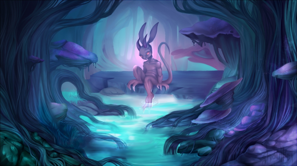
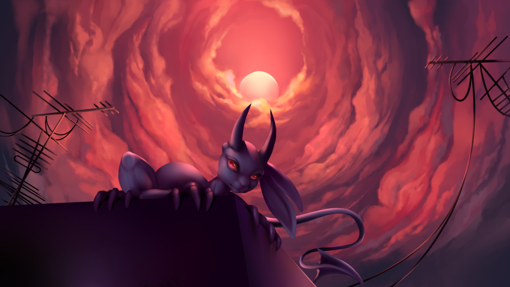
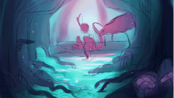


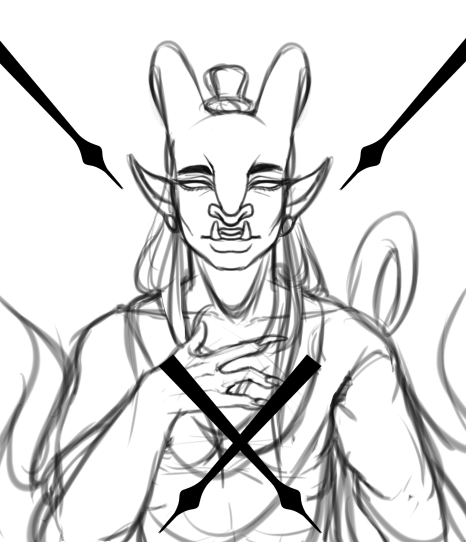


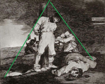
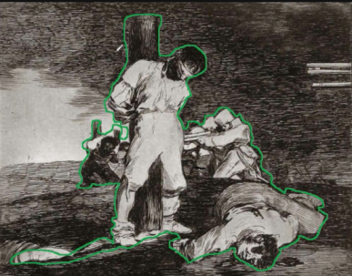

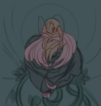


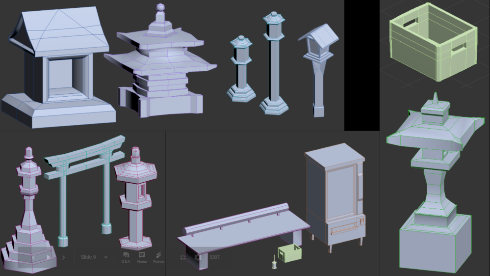
")
")
")
")
")
")
")
")


")
")


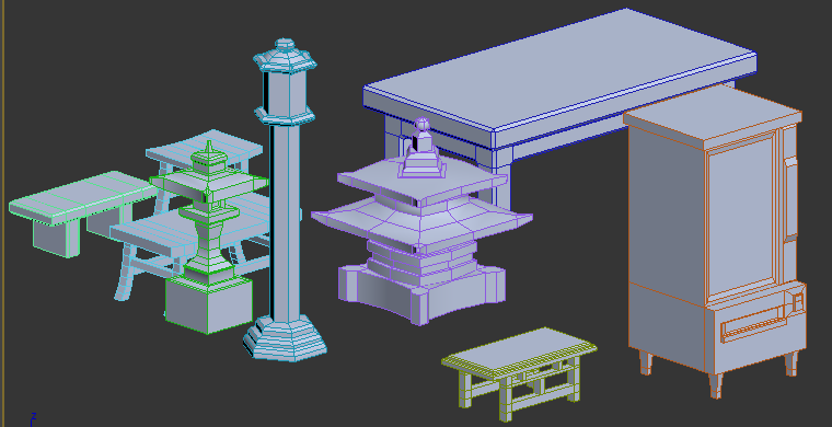
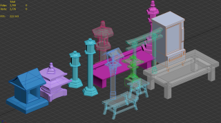


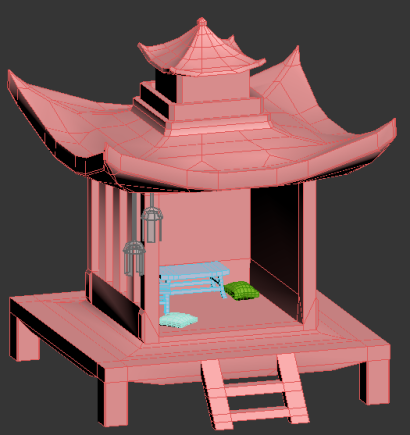
")
")


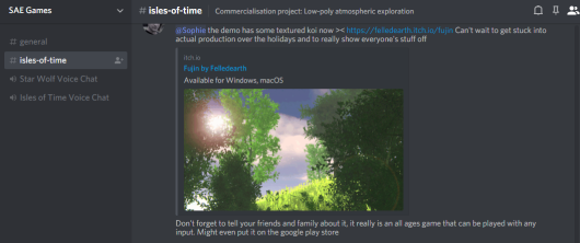


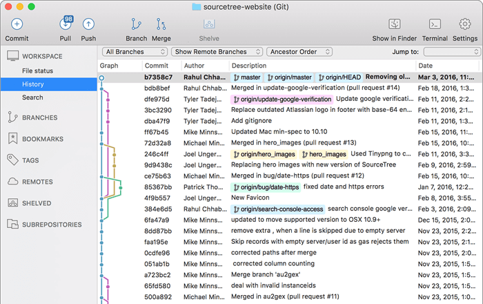


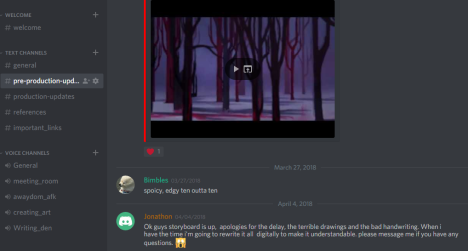


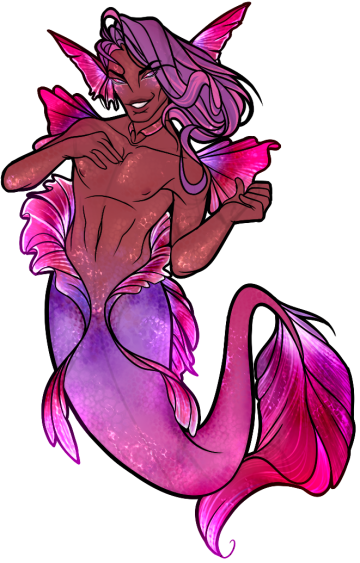


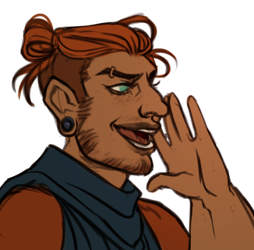
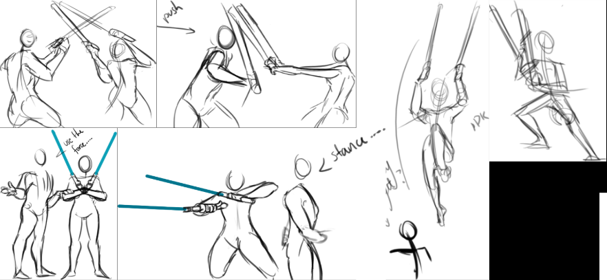

.png)


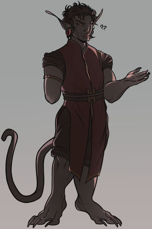


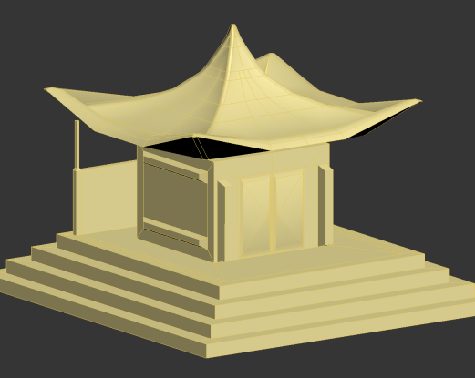
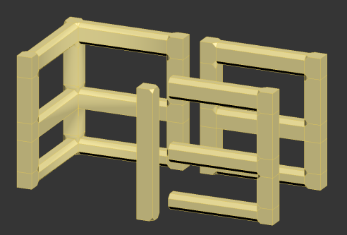


 Work in progress stuff.


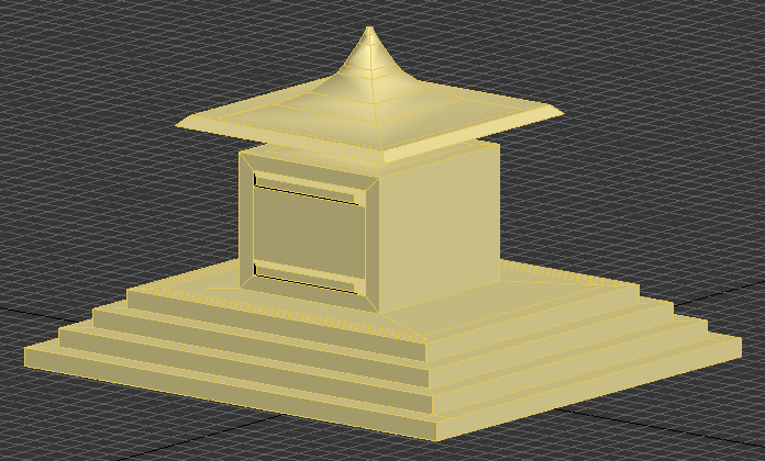
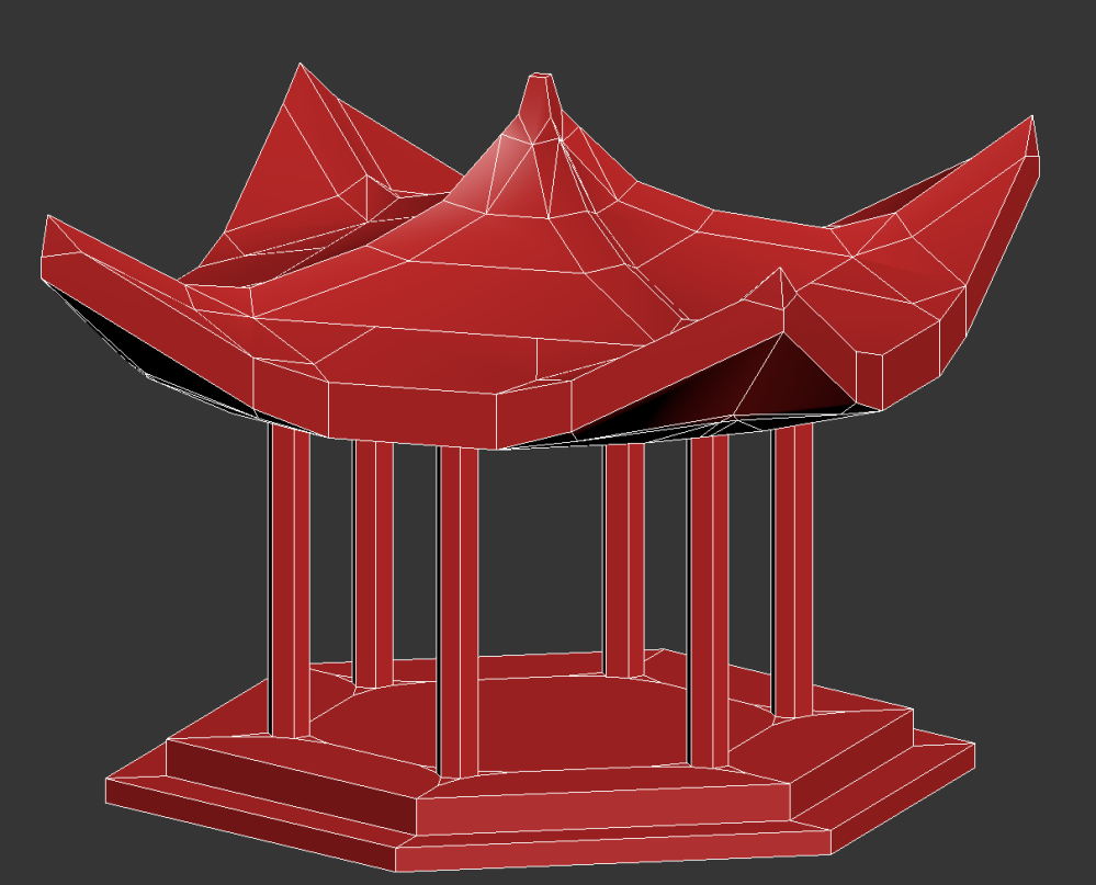


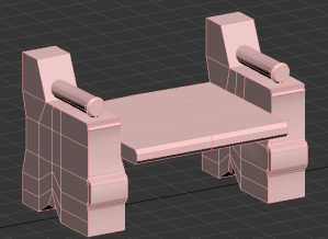

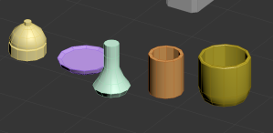


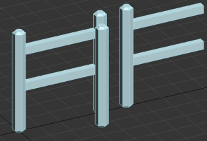
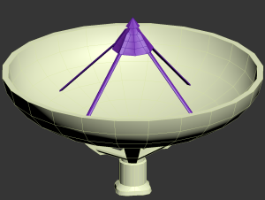


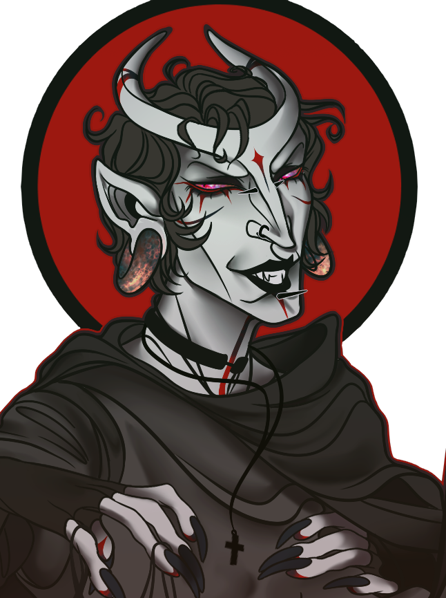


")
")
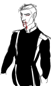

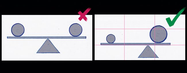

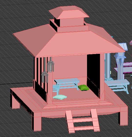
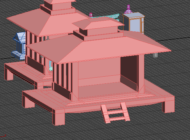
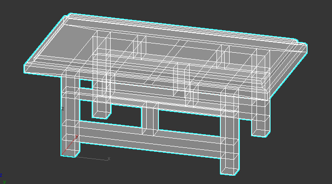
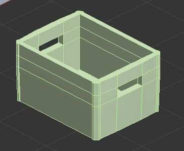
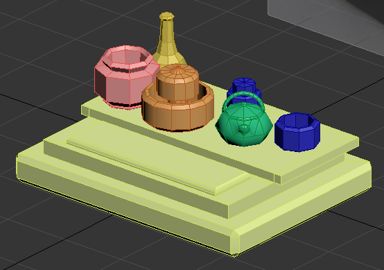
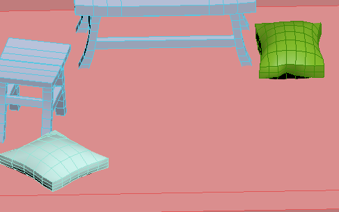


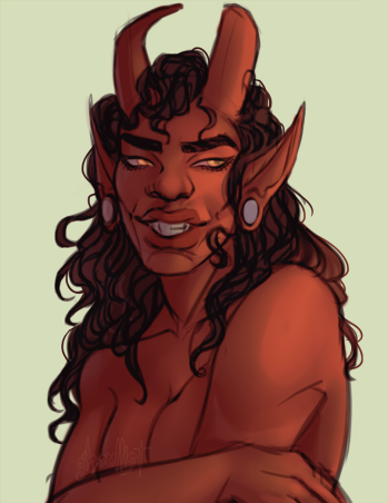


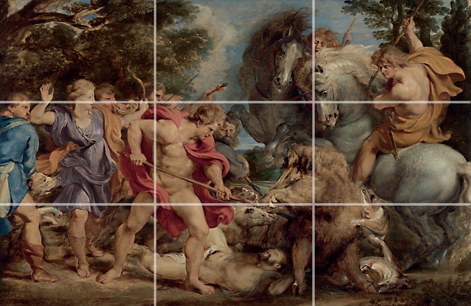
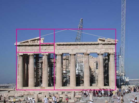

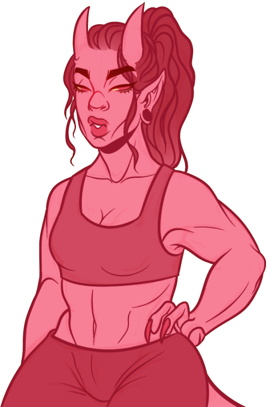
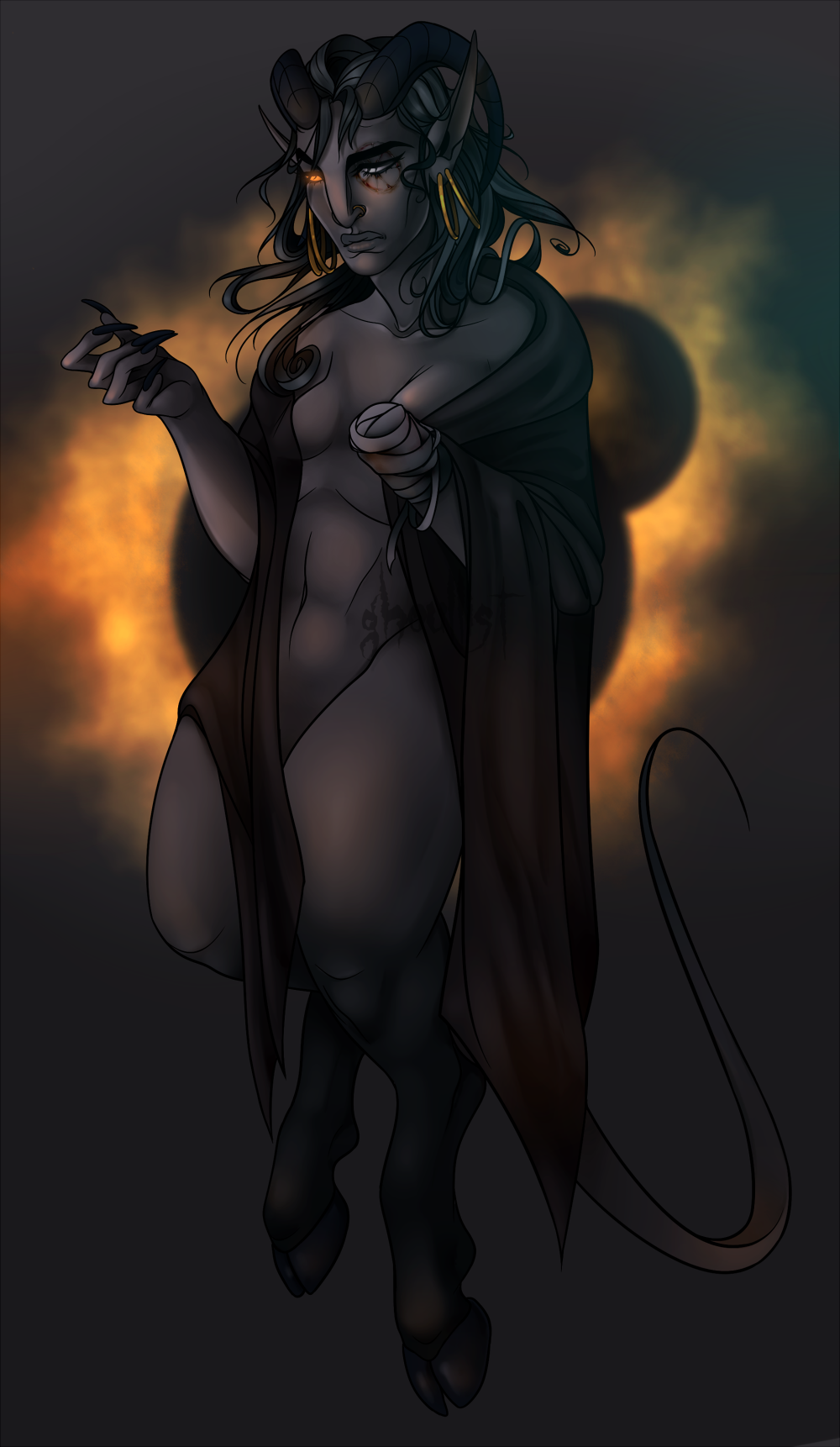