Asset Production Pipeline

For my Foundations of 3D Graphics class, we were tasked with creating an asset for a video game platform. Rather than opting for an organic asset, we were required to adhere to something non-organic, perhaps a spaceship, or weapon. An important point to consider are the constraints of video game engines, primarily the total polygon count of the model.

During the preliminary stages of this assignment, I decided that I wanted to create headgear, particularly something like the old diver’s helmets of the 20th century.

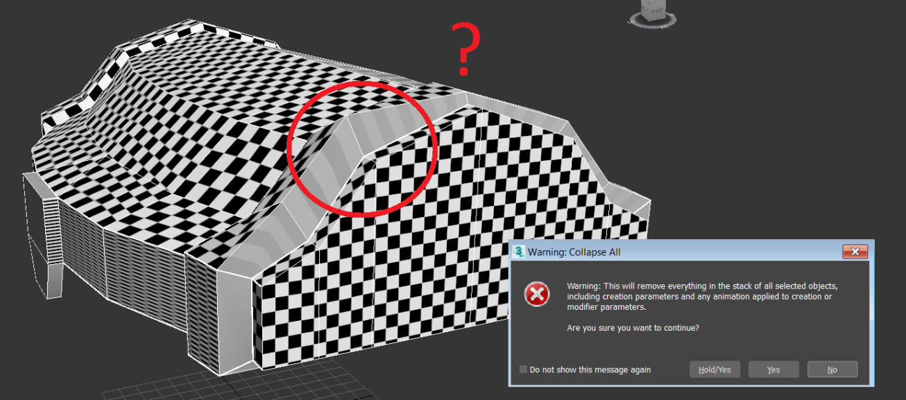
My first attempts at modelling were…unsuccessful, to say the least. I found that the reference images were far too complex for my relatively beginners skills. The related tutorials I researched (on helmet designs) weren’t too informative in terms of how to construct the diving helmet. Although I found that you can construct the “cages” around the openings using splines… (detailed in a brief tutorial here), the main method of construction the tutorials used was relying on symmetry, which is obviously a problem with such an asymmetrical design.

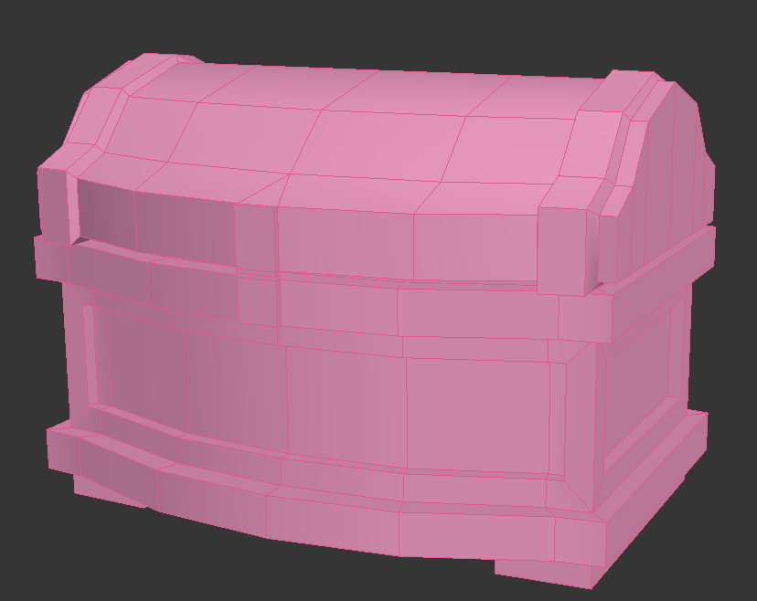
By this point, a week or two in, I began searching for an easier alternative to the complex helmet. I decided to settle for a fire hydrant, which, although relatively simplistic, if done well, will meet the requirements of the task.

Variations on fire hydrant designs means I could potentially add other elements, such as a chain or extra bolts, like the reference pictures detailed below.

I eventually settled with this reference image, which was imported as an image plane to directly model from:

542296-fire-hydrant-with-clipping-path-stock-photo

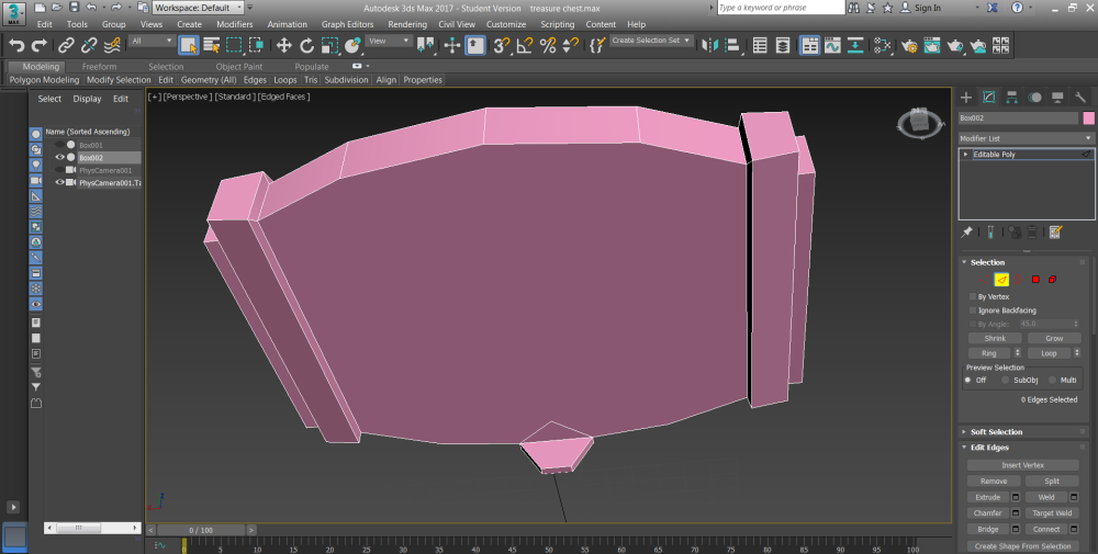
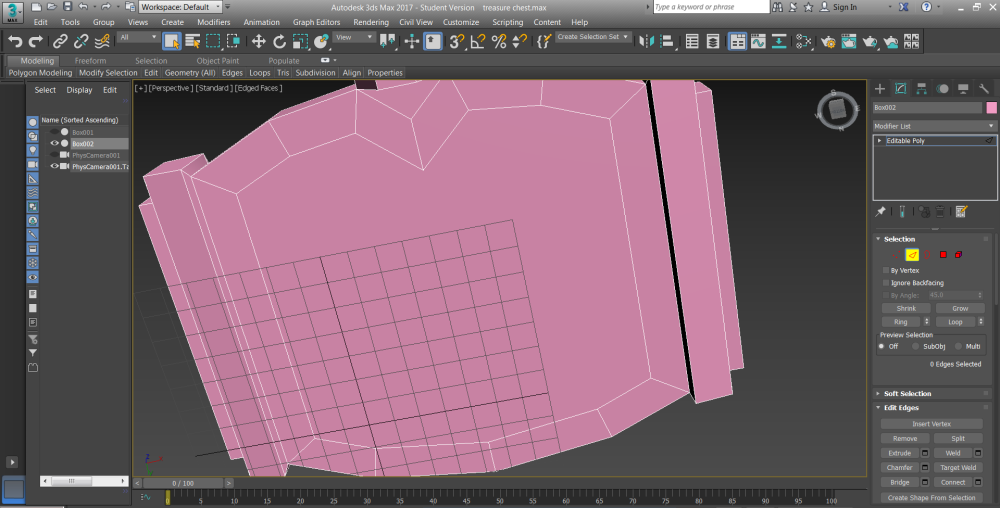
Although I originally had trouble modelling the fire hydrant by trying to constraint the main body to a single polygon, I eventually combined several different polygons and attached them to form a single polygon before exporting the UVs.
The bolts were originally constructed separately before merging them with the main body using the same method.

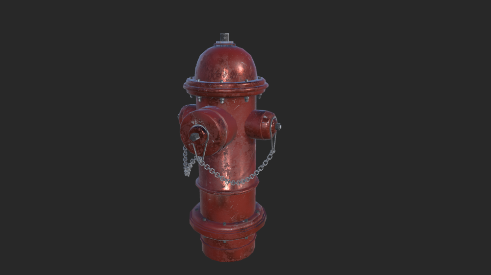
When creating the chain, I used multiple copies of a modified Torus primitive, rotated, and attached to form a long chain. By using a path deform modifier in combination with a line spline, I was able to warp the chain around the hydrant protrusions to create the product below:

yewp

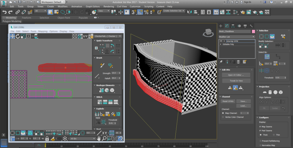
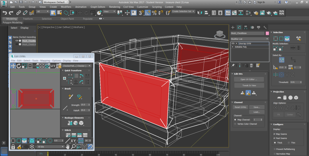
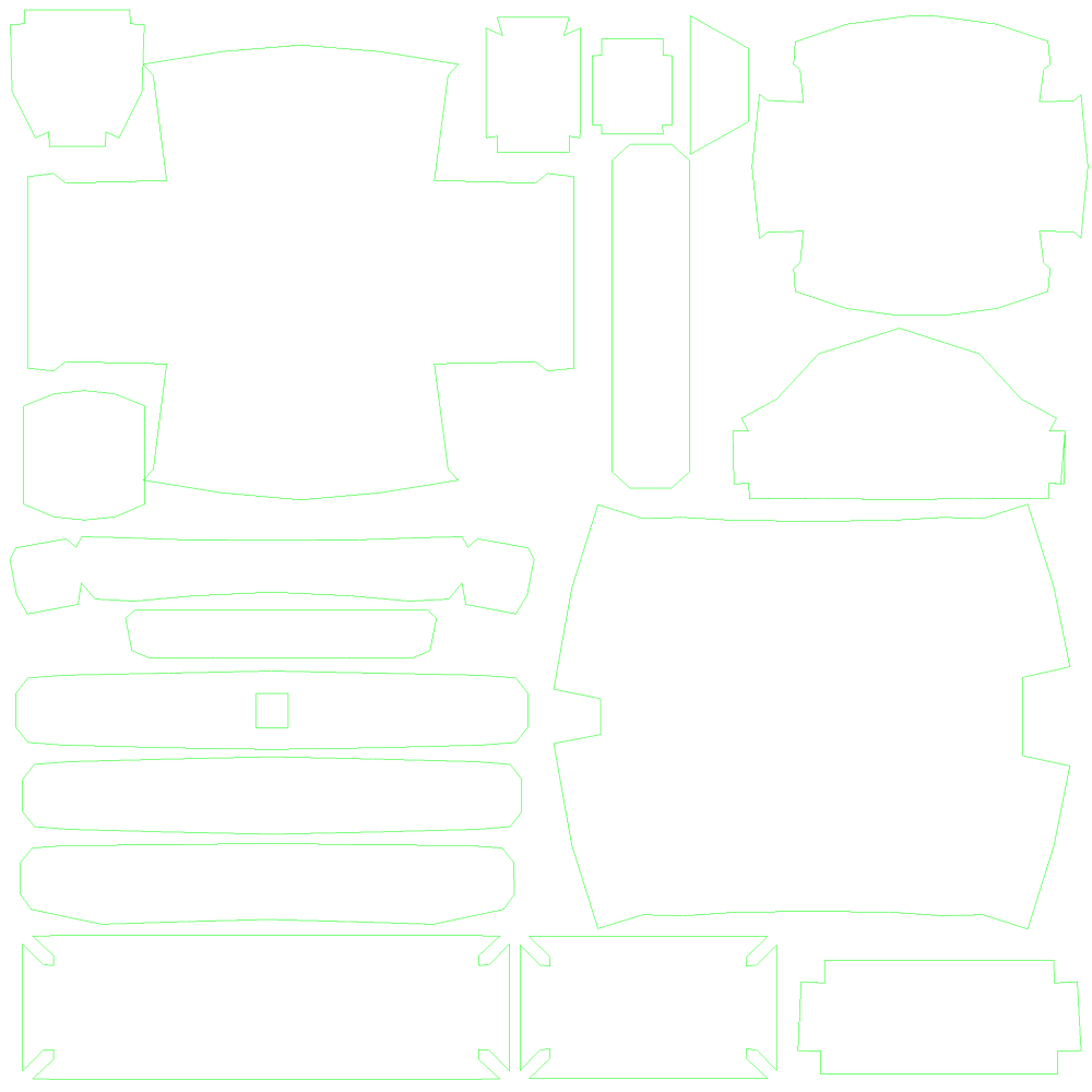
In terms of UV mapping, it was a relatively straight forward process, although due to increasing time constraints I had to use the automated functions of the UV editor, namely the auto-resize (resized the UVs in relation to their size on the model) and auto-packing (which packed the UVs automatically).

i qwant to die

Unfortunately during the baking process, I misinterpreted the tutorial, which required a normal map to be baked when using a combination of both a high and low poly model. Because my model was already relatively low-poly, this baking process was unnecessary, and I wasted time trying to find the error in the program.

After realising all I needed was an ID map, I went straight to texturing in Quixel!

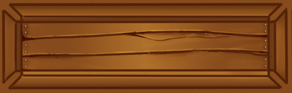
Beginnings of the texturing process.

I definitely wanted to go with the traditional red fire hydrant motif . First starting with base materials, I then went in with secondary materials for more visual interest. Rather than leaving the main body flat, I chose to include an additional rough metallic map to add a bit of wear and character to the asset.

This slideshow requires JavaScript.

screen04After a quick export using Quixel’s animation feature, I put together a short video in Adobe Premiere!

This assignment presented a new challenge in my animation journey. I often found I had to resist the urge to diligently follow provided tutorials and improvise on my own account, particularly during the modelling stages. My progression from the previous assessment to this one was ultimately quite a positive transition, especially in terms of time management and general ease, having been previously acquainted with the program. The introduction to the Quixel Suite might just have been my favourite experience in this module thus far! Texturing was inevitably made easier, and the high level of customisation (now with the addition of different maps) meant that the final product looked much better than I originally expected.

Thanks for a great first tri, guys!

Pirate’s Gold: Rendering, Compositing, Video Editing (The Finale)

Rendering

I had more than a little difficulty rendering this animation, and the entire process likely took almost two days.
My first attempt at rendering, which was left overnight, had not finished by morning – not due to any complications with the render set-up, but rather, the fact that the laptop I was borrowing went to sleep and had no background processes running. Alright, no biggie. I can render it at the campus whilst I’m staying there during the day.
…Wrong? It rendered quickly enough, in approximately 2.5 hours, whilst I did some background work, but with terrible quality.

Less than appealing. Alright, moving onto round three. I tweaked the settings so that the rendered animation would have a far higher quality. Even after leaving it to render overnight (high quality obviously means a longer rendering time) I returned to find a video with the exact same quality as my previous attempts.

A little disheartening, obviously, but I had made preparations with my friend to use their computer (which had already had the Autodesk program files installed) to render my animation overnight. And…the exact same result. It was at this point I realised I had been rendering the files into the wrong format – which explained the terrible quality.
With less than a day to turn in the assessment and time running out, I made a last ditch attempt to do a QuickSilver render. Although the quality will undoubtedly lessen, with my options narrowing, I didn’t really have much of a choice.

Because I needed to change the lighting, I went with a relatively bright skylight with an orange tint – mainly to mimic a sunset.

Compositing / Editing

Decided to head over to Adobe Premiere for the video editing effects.

In terms of compositing, in order to add authenticity to the video (since it is still meant to be an advertisement) I added an overlay, as if the animation was made for an android app. The title, “Pirate’s Gold,” was also implemented in a similar fashion, using a visual overlay.

nice

0031ce0d70c49769d1bcb7bb08319044.png

Even though I had planned to investigate After Effects CC and further enhance the assignment, my issues with the rendering put off valuable time. I decided it was more practical to work with what the tutorial provided me with rather than risking not submitting the files on time. Besides, the new orange lighting looks great as it is – no real need to edit it further.

The audio piece I chose was simply a remix of the traditional “Pirates of the Caribbean” theme by Hans Zimmer, in a less serious, light-hearted tone by Raz Alon. Add some generic punch sound affects to enhance the action and we’re just about set to export!

Reflection

Although the experience was full of obstacles, overcoming them and gaining texturing, mapping, modelling and editing experience was fulfilling. Whilst reaffirming the fundamentals of a production pipeline I gained more insight into the 3D animation industry itself, alongside the processes and programs used to create everything from feature length films to advertisements. As this project is closing, I am eager for the freedom in my next assignment, if a bit apprehensive. I hope this experience helps to reduce my error count in future endeavor.

Pirate’s Gold: Lighting

In order to create some fill lighting for the scene I implemented an omni light, which created a smooth fallout in all directions. In the Advanced Effects tab, there is an option for “Ambient Only,” which, in essence, makes the light have no specific directionality. By default, this lighting applies to all models in the scene. If rendered using this setting only, the scene will have flat lighting such as the screenshot below (ignoring the highlights already implemented onto the texture).

22222

The textures are presented flat and at face value. In order to have some soft, albeit defining shadows for this scene I added the mental ray ambient/reflective occlusion shader based on the recommendations of the video tutorial. The shader deposits small contact shadows in darker areas where light is blocked within the environment, or where models interact with the plane.

Although I need to maintain quality for this assignment, it will likely take longer since I’m rendering it on a laptop. Therefore, although the recommended sample size is 64, I went with a lower value at 50. In regards to the maximum distance for the ambient occlusion parameters, I went with a value of 20, also recommended by the video tutorial.

Hey

With the option to change the colour of the shadows, I went with a lowly saturated red colour, mainly to highlight the warmth of the scene. Even if the difference between the black and red shadows is minimal at this stage, I still think it’s an important aspect to have the lighting match the palette of the scene itself.

22222

Rendered scene with black shadows versus that with a darkly saturate red.

To ensure the shadows were pointing outwards from the center, I adjusted the co-ordinates to start at 0X0Y0Z, after which I adjusted it to fit more towards the middle of the scene, as the board itself is slightly off-centre. And that’s the lighting finished!

Pirate’s Gold: Texturing

Although I do have a little more experience with digital art programs, they’re mainly limited to drawing human characters rather than texturing materials and surfaces. So, even with a degree of prior practice, I can’t say with confidence that this texture is going to be anything more than a little average!

In terms of the program itself, I typically use Paint Tool Sai – and although very similar in terms of function, has a very different layout to Photoshop. In most iterations of the chest I’ve seen thus far, artists have made use of gradients to further accentuate lighting and shadows. Immediately I ran into a problem: Sai doesn’t exactly have a gradient tool. I basically had to choose between badly blurred gradients, staying in my comfort zone or learning the ropes of a new program and achieving a better result…and I picked the harder option.
Although it was difficult to adjust (mainly confusing shortcuts and tools) the gradient tool was a godsend! The highlights on the metal looked clean and would have likely turned out a bit dodgy had I gone with the second option.

ha2

When covering the seams for the wooden panels, it was advised to add a “border line” to both deepen the shadows and mimic real-life wooden texture. In this case, I modified the default brush to be more textured.

Ha

The straight mesh lines were quite easy to do – using either the stroke tool or by simply using the Shift + Click straight line method. In terms of the wooden strokes, which are most effectively done so with a tablet and pen pressure, I ended up having to switch back over to Sai. This was due to the fact that, even though I installed the latest driver, the laptop I was using (with Photoshop installed) wasn’t registering my tablet in the slightest. Rather than trying to troubleshoot the problem (at this point time started becoming a constraint I needed to consider) which might have eaten up my time, I chose to just go back to the laptop where my tablet was working and add all the details there, since most of my gradients were applied anyways.

Sai’s default file format is .sai, it does have the option to open .psd files, although at the cost of several of Photoshop’s functions – mainly certain tools and layer types. There is a possibility that the absence of functions will change the appearance of the file itself, so I made an additional copy in the case that it does happen.

yikes.png

Now with the addition of pen pressure, I was able to add some of the recommended details, namely cracks in the wood, varying light textures (to create the illusion of a textured surface), highlights on the wood and nails along some of the chest edges. I finished the texture with a keyhole on the lock.

Here’s the finished product:

yiykes.png

chest final texture.png

Pirate’s Gold: UV Mapping

Before applying any texture to the chest, the mesh needed to be flattened into a series of two dimensional shapes, taking care to not have any polygons out of portion (otherwise the texture will become either blurry or stretched), using the planar projection technique.

When unwrapping breaks were inserted to avoid having the texture stretched, such in the example below, wherein the green highlight indicates where the mesh has been broken. This is done because the highlighted polygons, whilst flattened on the axis, would have been squashed and distorted if the mesh had not been broken.

10.png12

After breaking the edges in the corners, I was able to relax the mesh and flatten it out into an accurate representation of the chest faces.

13.png

Before (with “squished” faces) and after.

The unwrapped meshes will then correspond to the faces selected on the model. Success!

8

In cases where the texture will be the same on both sides, both corresponding meshes are flattened on top of each other. This is useful for when I need to avoid creating the same texture twice, when it will just be the same. When the two meshes occupy the same space on a UV map, they will also occupy the same texture. Although a bit tedious, the vertices of the second mesh were attached to the first one in order to ensure they both correlate exactly. In the example below, although only “one” mesh has been selected (though, in reality there’s two directly on top of each other), both areas are shown to be selected on the chest.

9

Unfortunately at some point into unwrapping the chest I realised that I had distorted an area on the lid’s rim. I didn’t feel particularly like going back to one of my earlier saves and repeating the unwrapping process all over again (that’s theoretically almost two hours wasted) so I simply collapsed the modifier list and reverted to the editable polygon mode.

something.png
It’s unlikely that this model going to be absolutely perfect now that I’ve encountered this error, but there’s nothing much I can do. Time to keep progressing!

Aside from a few hiccups in the beginning, the growth of the UV mapping progress became quite easy after practice – it makes up for in simplicity what it consumes in time. The overlapping process done prior also allowed the space to be used more efficiently within the UV space.

Chest UVs

Exported UV space, rendered into a 2048 x 2048 PNG file.

The UV space, now converted into two-dimensional image plane, will be used as a layout for the texture files – discussed in the next section of the production pipeline.


Pirate’s Gold: Modelling! …and lots of problems.

When I mentioned I was new to 3DS Max, I wasn’t exaggerating. It took me a solid week of editing, going back to the drawing board, restarting and contacting my lecturer for advice before I managed to construct a chest I was content with.

My first attempts during the early stages of the assignment were mainly to get a feel for the program and were below satisfactory and didn’t progress further than just preliminary shapes and details. Although it may seem like wasted time at base level, it was extremely useful for familiarizing myself with the program, particularly short-cuts, etc. which will make future construction much easier.

During one of my later attempts at modelling, although the main construction of the chest went smoothly, I ran into trouble assembling the chest lid. Under advice from a lecturer, I chose not to wrap an edge connection around the entirety of the chest, and so, when it came to extruding the underneath of the chest to form the interior, I was unable to use the connections to extrude upwards.

1

No guidelines for the extrusion.

When I tried to remedy this by insetting the pre-existing lines, the chamfer I had done previously to create the lock managed to distort the inset into a different shape than required for the interior.

2.png

In addition to pre-existing problems, at some point I had managed to change the former connections on the top portion of the lid. Although I’m not entirely sure how it happened, I assume it was because I selected some edges in the area whilst attempting to revise my previous mistakes regarding the chest interior. It was at this point I decided that constructing a separate lid would be an easier option than trying to fiddle with settings (when I most likely would not have achieved a desired result in any case), and to obviously follow the tutorial more closely.

3

Whilst going through the stages of constructing a new lid, I ran into another problem! This time it was something I had relative ease with during the first attempt: scaling the chest inwards along the X axis, as shown in the tutorial videos. The problem wasn’t that it was distorting the model or anything along those lines, but rather that I couldn’t do it in the first place.

4.png

Attempting to drag the X axis inwards using the scale tool and failing miserably.

After contacting a lecturer, we concluded that the problem was I had neglected to use the selection centre tool. I switched to scaling the vertices instead and achieved a similar result as the one in the video, without having to use the aforementioned tool.5

The selection centre option (credit to Steve).

6.png

Finally achieving the desired scale.

After the first few debacles, the remaining experience was devoid of any complications and I managed to construct a relatively average looking treasure chest!

7.png

Pirate’s Gold: Pre-Production

The style, themes, and projected vision of the project is decided during the pre-production stage. As discussed in the brief provided, the client is looking for a short advertisement to market their upcoming board game, “Pirate’s Gold.”

The storyboard, almost like a “blueprint” of the finished product, helps to set the basic parameters for the employees and others working on the project. In this case, the one provided is as follows.

image00

Although the major details have been provided, aspects such as certain camera angles and timing can be tweaked.

For this advertisement I think it would be ideal to add some visual interest by having some sweeping camera angles, or perhaps a consecutive one that circles around the treasure chest, which is the focal point, as recommended by the brief. It is important to consider that, because of the short time frame, (ideally 15 – 30 seconds long), to not have the camera angles change too drastically, as it may disorientate viewers or simply distract from the advertisement itself. I additionally want to avoid sharp angle cuts and have the advertisement play out without needing one at all.

Whilst the majority of assets and textures have been provided, the focal piece, the treasure chest, is to be constructed as part of the assessment. Although there is always the option of combining the tutorial and some artistic license to create a unique piece, since I’m not well-versed in 3DS Max, or just generally with 3D modelling, I’ll be following the tutorial closely. With the texturing, I will have more free reign, due to being a bit more experienced with art programs. It is likely that I will preserve the original style but add a little twist if I decide to at that point. The style is as follows:

PiratesGold_render

The main challenge will be adding enough detail so that it creates visual interest but avoiding too much realism – it’s a cartoon, after all.

In the end, the proposed client requires an mp4 file with H.262 compression (a video of the finished animation), but in this case, since it is still an assignment, we are required to submit the video alongside working files and documentation of progress (which is when these blog posts come in!).

Images retrieved from https://docs.google.com/document/d/1LnIh4ZMjMIVsrryVO0yT3c0_mtXnwOgrzFu3i0emIPE

Inspirational Practitioner

Although my original love of animation was devoted to the 2D platform, exploring entertainment in my early teenage years lead to my discovery of the Bethesda games, and ignited my love for open-world 3D fantasy environments. Anyone with an eye for environmental design has likely heard of Noah Berry, the man behind the environments in several Elder Scrolls titles (Morrowind, Oblivion, Skyrim) and Fallout 3 (80 Level, 2015). With Skyrim being one of my all-time favourite titles and one of the most beloved games of recent decades, it’s easy to see why his influence has been so prominent.

Despite the graphics beginning to show their age after more than five years since release, the sheer enormity of in-game environments, combined with realistic, believable climates and an open-world design has allowed Berry’s work on Skyrim to stand the test of time.

During the pre-production stage of game construction, artists like Berry take into account both the tone, degree of realism and gameplay events to ensure the mood of the environment correlates with that of the game. Real world references, screenshots, and early concept sketches are used during the beginning stages of world creation (80 Level, 2015).

the_elder_scrolls_v_skyrim_concept_art_ray_lederer_07athe_elder_scrolls_v_skyrim_concept_art_ray_lederer_01a

Examples of Skyrim concept art. Retrieved from http://conceptartworld.com/news/the-elder-scrolls-v-skyrim-concept-art-by-ray-lederer/ (By R. Lederer).

During landscaping, environmental artists begin by conceptualizing the larger lay of the land, constructing larger features like cliffs, valleys, passes and roads are implemented before specific details like vegetation and individual rocks (80 Level, 2015).

soulcairn-1-1024x576

Skyrim. Property of Bethesda Studios. Retrieved from https://80.lv/articles/skyrim-designer-on-building-virtual-worlds/

His role in the Skyrim project encompasses large scale terrain / mountain prototyping and establishment, generating exterior world visual design, terrain layout planning and generation, atmosphere, weather and exterior lighting construction and refinement and documenting this process for landscaping workflow and reference (Berry, 2017). Berry uses a combination of both Photoshop and 3DS Max along with a collaborative creation and design team, and proprietary world editing and construction software.

Although I’m not necessarily majoring in 3D animation, artists like Berry sure make me wish I was. The sheer depth and scope of Skyrim’s in-game environment is enough to make any gamer with more than half a brain feel inspired, and for fellow artists, it’s borderline ridiculous. His scope of environments, from post-apocalyptic to epic fantasy, showcases both ingenuity and practical skill, and whilst his level of achievement is years away, it’s something to aspire to. 

His blog, alongside his other works, can be found here http://noahberry.weebly.com/

References used: 

80 Level (2015) Finding the Look of Open Game Environments. Retrieved from https://80.lv/articles/building-open-worlds-with-skyrim-envir-artist/

80 Level (2015) The Guide to Open World Environment Design. Retrieved from https://80.lv/articles/skyrim-designer-on-building-virtual-worlds/

Berry, N. (2017) Noah Berry (Weebly portfolio). Retrieved from http://noahberry.weebly.com/

Highlights within the History of 3D Graphics

The history of 3D graphics is littered with trial and error, but is dominated with innovations, from the first implementation of CGI within a film, to the fairly recent discovery of real-time generated motion capture systems. The evolution and devolution of this art form is crucial to understanding how it has transitioned from the dream of a few to a widespread technique implemented across various mediums, including film, games and design.

The first notable 3D graphic success was the arcade game Battlezone; a first-person tank combat simulator from Atari, released in 1980. The breakthrough came during at a time where the gaming scene was dominated by simplistic 2D games such as Space Invaders and Pac Man (TV Tropes, n.d.)

In film, the first extensive computer-generated imagery emerged in 1982, with Steven Lisberger’s Tron. With computers an enigma to most modern audiences, a film that conjured more than a quarter-hour’s worth of digital effects was testimonial to the advancement of technology at the time.

hero_eb19820101reviews201010350ar

Retrieved from http://static.rogerebert.com/uploads/review/primary_image/reviews/tron-1982/hero_EB19820101REVIEWS201010350AR.jpg

At a time where few companies knew how to utilise these effects, a few individuals pushed past the constraints of the current computer capacity (1/2000th of the capacity of an average PC, to put it into perspective) to create the first movie in the Tron saga (Semlyen, 2015).

Further reading… http://www.cgw.com/Press-Center/Web-Exclusives/2011/Original-TRON.aspx

The prospect of creating a full-length feature animation was even more far-fetched, but when combined with an inexperienced crew and a small budget, the creation of Toy Story was a monument in 3D animation a little more than a decade after Tron’s release. Its overwhelming success set the foundations for Pixar a further 15+ films and accumulate a total of 26 Academy Awards (Zorthian, 2015).

Although Gollum from the Lord of the Rings franchise isn’t the most likeable (or the prettiest) character to ever exist, his appearance in the second installment of the trilogy (2002) represented the first character to ever be rendered using a real-time motion capture system to fully interact with other on-screen actors (Semlyen, 2015).

cg9b7724w1z8x8atq933

Retrieved from https://www.afterfeed.com/story/detail/8762/these-three-creatures-are-actually-related-find-out-how

Jim Rygiel, the visual effects designer, remarked that Gollum was “…a creature that you couldn’t really shoot in a rubber suit because he really has to interact…we realized we had to make this guy fully computer generated and yet ensure he looked absolutely real in his actions and the way he speaks,” (as cited in Remington, 2017). With a combination of both new software already existing and advancements written by the crew, they were able to create a realistic, albeit disproportionate biped who stood little more than three feet tall.

These advancements furthered with the facial recognition of Avatar (2009), which showcased a studio full of LOTR veterans working together to create a graphical masterpiece.

6190_12_screenshot

Retrieved from http://www.mr-movie.com/avatar-movie.html 

Other references used:

Remington, S. (2017) The Lord of the Rings, The Two Towers. Retrieved from https://www.remingtonscott.com/lord-of-the-rings-two-towers

Semlyen, P. D. (2015) A History of CGI In the Movies. Retrieved from http://www.empireonline.com/movies/features/history-cgi/

TV Tropes, (n.d.) Video Game: Battlezone (1980). Retrieved from http://tvtropes.org/pmwiki/pmwiki.php/VideoGame/Battlezone1980

Zorthian, J. (2015) How Toy Story Changed Movie History. Retrieved from http://time.com/4118006/20-years-toy-story-pixar/

Header image retrieved from http://collider.com/steve-purcell-toy-story-that-time-forgot-interview/ 

Post Production: Compositing

The compositing process takes the rendered images from the previous phase and combines layers of ready-made material (usually input files) to create enhanced visual elements – encompassing everything from the atmosphere, mood lighting, to colour overlays and textures. 3D compositing can differ from 2D compositing, depending on the way in which layers can be made to interact and realistically effect with each other (wiseGEEK, 2016). Within 3D compositing, separate layers of input files allows the elements to overlap, thus creating a more realistic effect.

The materials can be sourced from various disciplines, and can include rendered computer animation, special effects, graphics, 2D animation, live action and static background plates (Creative Skill Set, 2017).

beforeaftercomposite

Retrieved from https://greyscalegorilla.com/tutorials/the-importance-of-compositing-a-layer-by-layer-breakdown-in-after-effects/

Programs like After Effects offer processes such as colour correction, blurs, RSMB Motion blurs and Lens flares (Campbell, 2010).

Enhancing the finished product if lacking in depth or weight can be achieved by rendering ambient occlusion passes, or ‘contact shadows,’ darkening the areas where two objects interact. This can help create the illusion of a unified space and add weight to the scene (Slick, 2017). It is also common for artists to tweak complex elements (smoke, fire, hair, etc.) in Photoshop post-production. Specified brushes can add subtle layers of detail that would otherwise be time-consuming to render within a constrained 3D program.

Colour-grading is an important step in the final composition, as colour, as a visual element, helps to influence mood and tone of the final product. Adjustments to the brightness, contrast, hue, saturation and colour balance can aid to create the desired aesthetic.

66693-barrel-distortion-1-5

An example of lens distortion. Retrieved from https://answers.unrealengine.com/questions/160433/how-to-make-lens-distortion-work.html

Lens distortion can be applied to scenes for a variety of reasons, to create low contrast, flares, and other intended blemishes depending on the desired outcome of the film. Chromatic aberration and vignetting are two forms of lens distortion that mimic real-life imperfections on camera lenses, and be added subtly to “work wonders” on an image (Slick, 2016). Other techniques include noise and film grain, which work to create a cinematic finish.

References used:

Campbell, N. (2010) The Importance of Compositing: A Layer by Layer Breakdown in After Effects. Retrieved from https://greyscalegorilla.com/tutorials/the-importance-of-compositing-a-layer-by-layer-breakdown-in-after-effects/

Creative Skill Set (2017) Compositor. Retrieved from http://creativeskillset.org/job_roles/358_compositor

Slick, J. (2016) Finishing a 3D Render: Colour Grading, Bloom, and Effects. Retrieved from https://www.lifewire.com/color-grading-bloom-and-lens-effects-2126

Slick, J. (2017) Finishing a 3D Render – Passes, Compositing, and Touch Ups. Retrieved from https://www.lifewire.com/passes-compositing-and-touch-ups-2127

wiseGEEK, (2016) What is 3D Compositing? Retrieved from http://www.wisegeek.com/what-is-3d-compositing.htm